There is an unexpected space when using typography inside grid item - Material v4.12
Open
Nobody has claimed this yet.
component: Grid
discussion
scope: system
- Dominant language
- JavaScript
- Stars
- 99.1k
- Forks
- 32.5k
- Avg merge
- 2d 17h
- Merged PRs (30d)
- 106
Description
There is an unexpected space between last item and second item.
My workaround is just use normal text instead of Typography
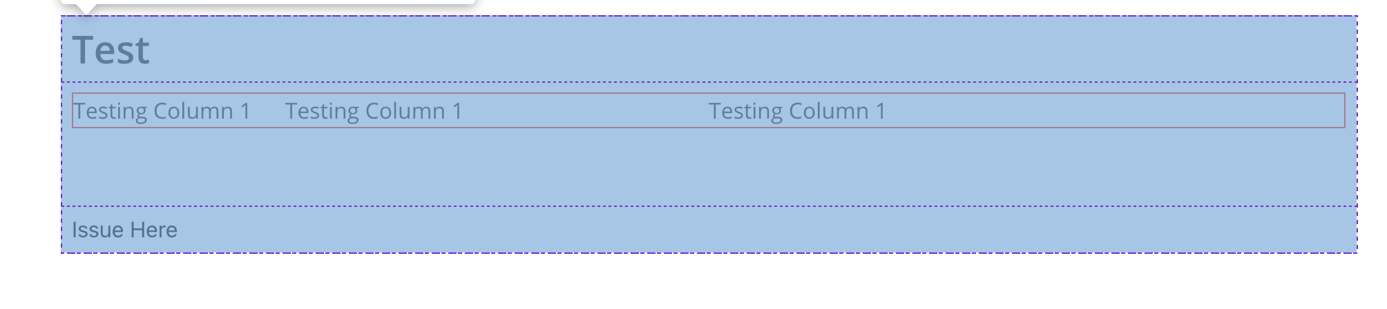
Steps to Reproduce 🕹
Here is my code
<Grid container direction="column" spacing={2}>
      <Grid item>
        <Typography variant="h1">Test</Typography>
      </Grid>
      <Grid item>
        <Grid container alignItems="center" style={{ border: '1px solid red' }}>
          <Grid item xs={2}>
            <Typography variant="body1">Testing Column 1</Typography>
          </Grid>
          <Grid item xs={4}>
            <Typography variant="body1">Testing Column 1</Typography>
          </Grid>
          <Grid item xs={6}>
            <Typography variant="body1">Testing Column 1</Typography>
          </Grid>
        </Grid>
      </Grid>
      <Grid item>Issue Here</Grid>
    </Grid>
I would appreciate if you could look into this.
Contributor guide
First steps
- Read the whole issue, then the project's contributing guide.
- Comment on the issue to say you are picking it up — it saves two people doing the same work.
- Fork the repository and make your change on a branch.
- Open a pull request that references the issue number.
Research direction
Start with the provided reproduction and inspect how Grid spacing interacts with Typography in the Material UI v4.12 implementation. Confirm whether the extra space is caused by the nested grid or typography styles, and consider the issue resolved when the reproduced layout no longer has the unexpected gap.
Written by the indexing model from the issue text.
Assessment
- Tech stack
- javascript, react
- Domain
- frontend
- Issue type
- Bug
- Difficulty
- 3/5
- Estimated time
- 1-2 days
- Activity status
- Stale
- Clarity
- Mostly clear
- Newbie friendliness
- 35/100