[Drawer]Tooltip to appear on hover, click and mousedown over icons of Mini Variant Drawer
Nobody has claimed this yet.
- Dominant language
- JavaScript
- Stars
- 99.1k
- Forks
- 32.5k
- Avg merge
- 2d 17h
- Merged PRs (30d)
- 106
Description
- I have searched the issues of this repository and believe that this is not a duplicate.
Summary 💡
A tooltip to appear on hover, click and mousedown over button icons of the Mini Variant Drawer to give the title or description (or both) of the buttons purpose.
Maybe just include Material UI's tool tip example as part of the Mini Variant Drawer example if it's easy to do (on at least one of the icons).
I am open to expanding this feature request to all or multiple components too. Just looking for suggestions now.
If this is more of a Support issue than a Feature Request, I am willing to edit this issue for such. Just let me know.
Examples 🌈
I managed to add Material UI Tooltip into sandbox example of the Mini Variant Drawer. It's easy to set up but needs more styling because there is too much space between the popup box and icon on hover.
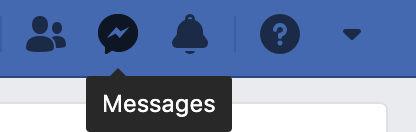
Facebook's example would be a good milestone to reach with this.
Motivation 🔦
I think it could be a useful feature to demonstrate. Especially when you only have so much space for your buttons with little description. It will provide an optional feature for more clarity.
The case of the Mini Variant Drawer (when closed) is a good example of this.
It could add more clarity. Keep it as an optional feature for this component.
Willing to create a PR on this and try it myself.
Contributor guide
First steps
- Read the whole issue, then the project's contributing guide.
- Comment on the issue to say you are picking it up — it saves two people doing the same work.
- Fork the repository and make your change on a branch.
- Open a pull request that references the issue number.
Research direction
Start with the Mini Variant Drawer sandbox example and the Material UI Tooltip example linked in the issue. Check how the drawer's button icons are rendered and how tooltip behavior is demonstrated. Done means the requested icon guidance works for the agreed interactions without excessive spacing, with the scope confirmed before implementation.
Written by the indexing model from the issue text.
Assessment
- Tech stack
- javascript, react
- Domain
- frontend
- Issue type
- Feature
- Difficulty
- 3/5
- Estimated time
- 1-2 days
- Activity status
- Stale
- Clarity
- Mostly clear
- Newbie friendliness
- 35/100