[Table] Improve mobile display / responsive stacking
Nobody has claimed this yet.
Assessment
- Difficulty
- 4/5
- Estimated time
- 3-5 days
- Newbie friendliness
- 35/100
- Issue type
- Feature
- Clarity
- Mostly clear
- Activity status
- Stale
- Tech stack
- javascript, react
- Domain
- frontend
Research direction
Start by inspecting the Table component entry point and compare its current mobile behavior with the linked responsive-table examples. Define how rows should stack with their headings on narrow screens, then verify that the table no longer requires horizontal scrolling while preserving the desktop layout.
Written by the indexing model from the issue text.
Description
Feature Request
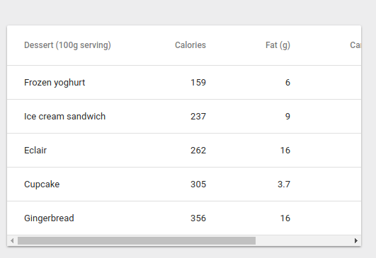
Can you guys make the table responsive to break into pieces with its Heading while right now we have to scroll left/right in mobile devices?
Expected Behavior

Example :
- https://codepen.io/zavoloklom/pen/yLmZeQ
- https://css-tricks.com/examples/ResponsiveTables/responsive.php
- https://semantic-ui.com/collections/table.html
Current Behavior
- Dominant language
- JavaScript
- Stars
- 99.1k
- Forks
- 32.5k
- Avg merge
- 2d 17h
- Merged PRs (30d)
- 106
Contributor guide
First steps
- Read the whole issue, then the project's contributing guide.
- Comment on the issue to say you are picking it up — it saves two people doing the same work.
- Fork the repository and make your change on a branch.
- Open a pull request that references the issue number.
More from mui/material-ui
-
type: new feature waiting for 👍
Difficulty 2/5 1-3 hours Newbie friendliness 68/100
mui/material-ui#48254 · 3 comments · 1 reaction ·
-
has workaround scope: avatar waiting for 👍
Difficulty 2/5 1-3 hours Newbie friendliness 64/100
mui/material-ui#48190 · 5 comments ·
-
has workaround scope: typography type: new feature waiting for 👍
Difficulty 2/5 1-3 hours Newbie friendliness 65/100
mui/material-ui#46488 · 2 comments · 1 reaction ·
-
has workaround scope: text field type: bug
Difficulty 2/5 1-3 hours Newbie friendliness 68/100
mui/material-ui#37216 · 6 comments ·
-
docs scope: autocomplete
Difficulty 1/5 1-3 hours Newbie friendliness 68/100
mui/material-ui#35713 · 5 comments ·
Similar issues
-
code-quality refactoring
Difficulty 2/5 1-3 hours Newbie friendliness 84/100
github/gh-aw-firewall#8816 ·
-
integration:quickjs org:external priority:backlog topic:code-interpreter topic:middleware type:feature
Difficulty 2/5 1-3 hours Newbie friendliness 74/100
langchain-ai/deepagents#6450 ·
-
optimization optimization:agents-md-curator
Difficulty 2/5 1-3 hours Newbie friendliness 86/100
githubnext/gh-aw-cao#13143 ·
-
status: needs triage
Difficulty 2/5 1-3 hours Newbie friendliness 88/100
-
Difficulty 2/5 1-3 hours Newbie friendliness 88/100