Agents window: redesign the 'needs input' UI (proposal + user testing)
- Dominant language
- TypeScript
- Stars
- 193k
- Forks
- 42.4k
- PR merge metrics
- PR metrics pending
Description
## Summary / recommendation
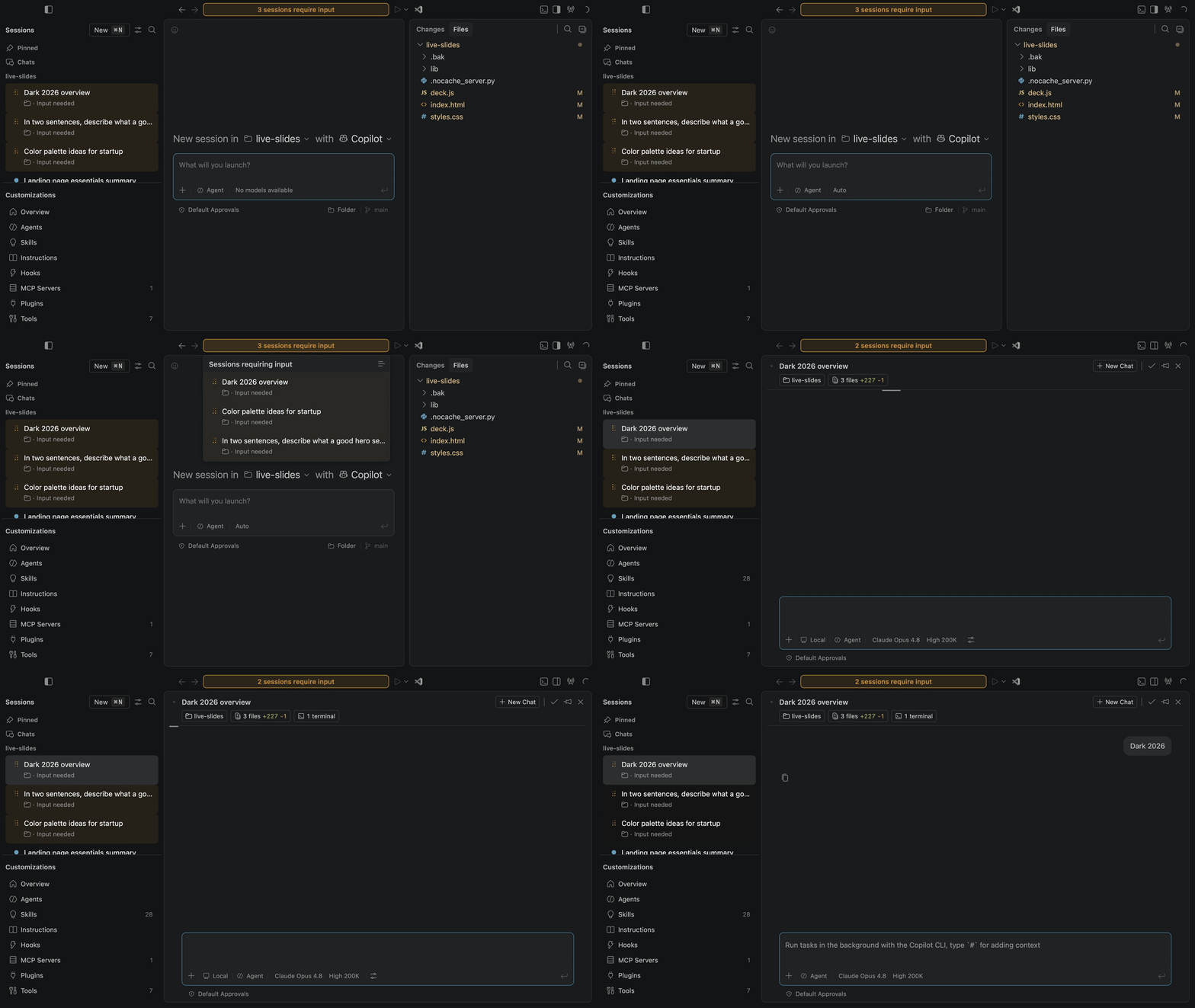
The Agents window currently signals **"a session needs your input"** with three inconsistent cues at once: the command center bar turns orange and **blinks**, the session rows in the list **pulse** continuously (in a different color token), and a chat tab dot appears. The blinking/pulsing is distracting, the two color tokens are inconsistent, and when a session needs input the command center **covers the active session name**, so with parallel sessions you can lose track of which session you are in.
This issue proposes a calmer, unified redesign, prototyped in a real Code OSS build behind a developer toggle, plus a UserTesting study to compare it with today's behavior. **Recommendation:** move to a single shared needs-input color token, remove the infinite flashing, and keep the active session identity visible with a compact, steady "needs input" badge to its right. Two variants (A and B) are offered for evaluation; Variant A is the recommended direction.
## Demo
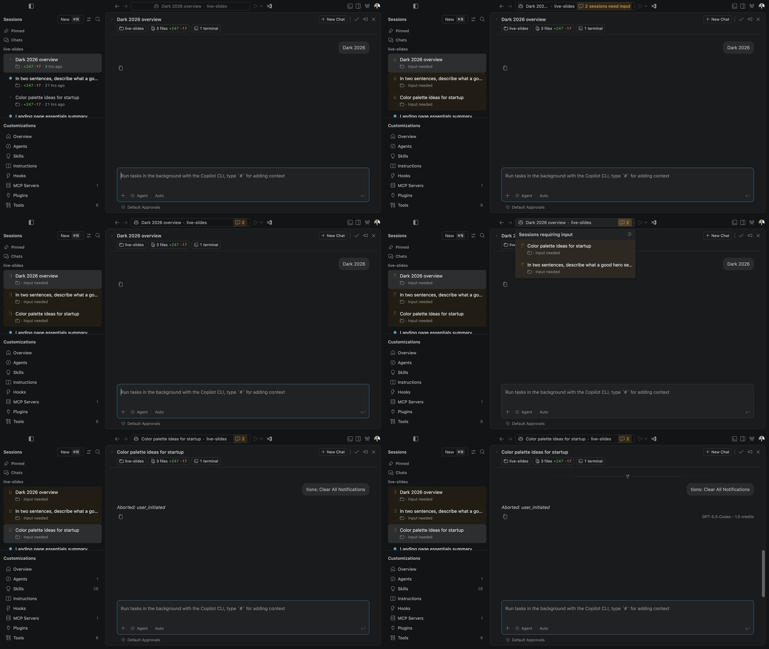
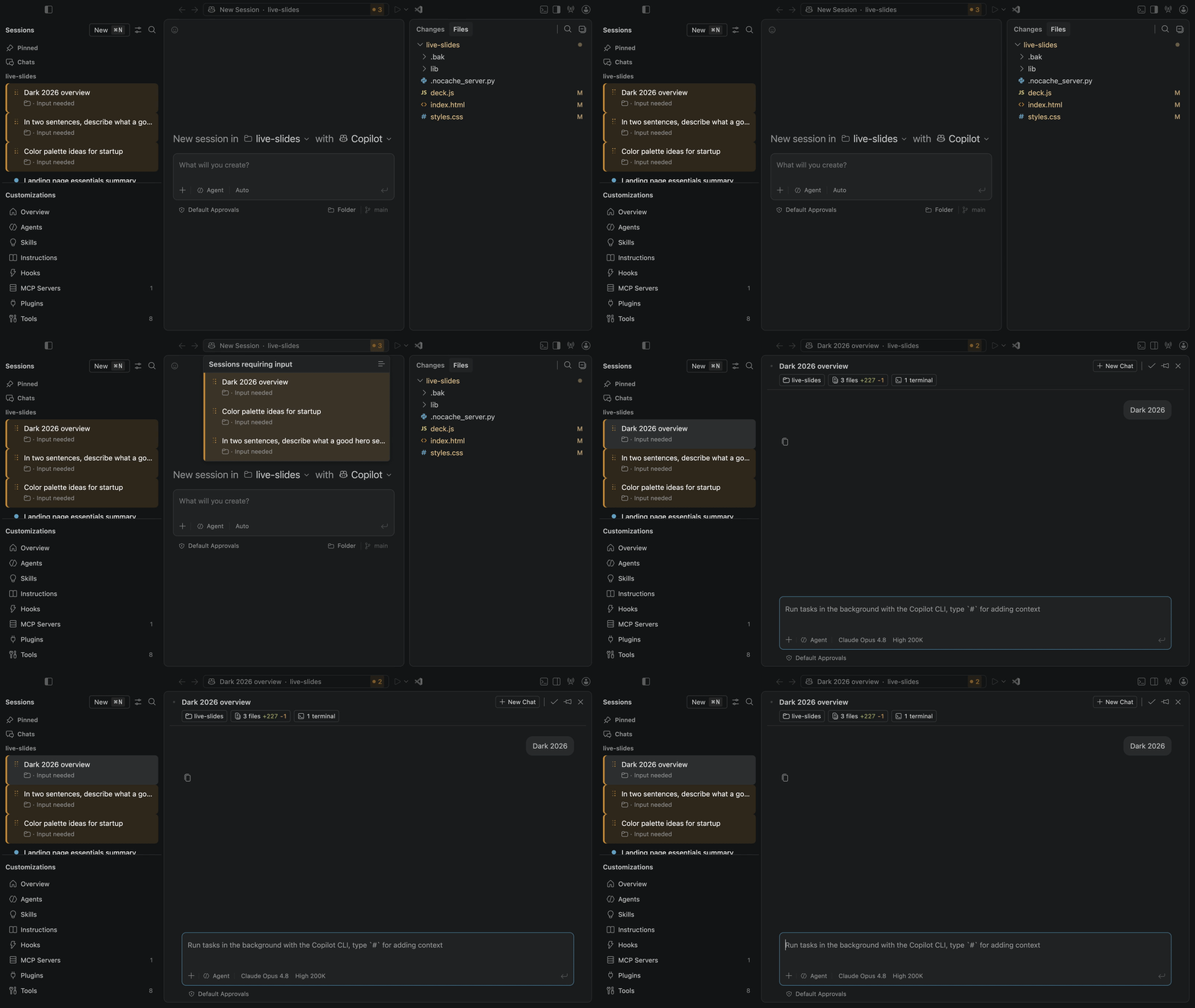
Each clip walks the full flow: a session enters "needs input", the user clicks the indicator, the "Sessions requiring input" list opens, and the user selects a session to address it.
**Current (today's behavior)** - flashing orange command center that covers the session name, plus continuously pulsing list rows.
[Watch the current-behavior demo (MP4)](https://github.com/eli-w-king/ux-research-media/blob/main/needs-input-redesign/needs-input-current.mp4)
**Variant A - "Announce then settle" (recommended)** - the command center keeps the active session name visible. Whenever a session needs input, a badge to the right briefly expands to read "N sessions need input", then collapses back to just the needs-input "!" icon and the count (the same needs-input icon the editor window uses). No infinite flashing. Clicking the badge opens the "sessions requiring input" list.
[Watch the Variant A demo (MP4)](https://github.com/eli-w-king/ux-research-media/blob/main/needs-input-redesign/needs-input-variant-a-v2.mp4)
**Variant B - "Calm center, prominent list"** - the command center keeps the session name visible with the compact badge from the start; the primary signal moves to the sessions list, where rows needing input get a steady, stronger tint plus a prominent left border.
[Watch the Variant B demo (MP4)](https://github.com/eli-w-king/ux-research-media/blob/main/needs-input-redesign/needs-input-variant-b.mp4)
## What changed (prototype)
- One shared color token (`agentSessionNeedsInput.foreground`) across the command center, sessions list, status icon, and chat tab (replaces the split `charts.orange` vs `list.warningForeground`).
- Removes the repeating blink/pulse in favor of steady treatments.
- Keeps the active session identity visible; the needs-input badge sits to the right of it instead of covering it.
- Developer toggle to compare live: **Command Palette -> "Developer: Cycle Needs-Input UI Variant (A/B)"** (plus **"Developer: Simulate Session Needs Input (Toggle)"** to demo without a live agent run).
## User testing
A think-out-loud UserTesting study is staged as a **Draft** (not launched) comparing the current behavior with Variants A and B, with per-screen clarity ratings and open-ended prompts.
- Preview the study: https://participant.use2.usertesting.com/px/#/preview/pre-study?participantId=9e44fef5-8d78-43d7-b5b8-c3f3d2ed8a09
- Audience: coders and vibe coders who use AI assistants in an editor (5 participants).
## Open questions
1. A or B, or a blend (calm center from A plus the prominent list border from B)?
2. Is the left border in B too strong when many sessions need input at once?
3. Should the badge count include failing-CI / unresolved-comment sessions, or only "needs input"?
Contributor guide
Assessment
This issue has not been assessed yet.