Agents window: clearer affordance for arranging chat panels side by side (2 prototype variants + user study)
- Dominant language
- TypeScript
- Stars
- 193k
- Forks
- 42.4k
- PR merge metrics
- PR metrics pending
Description
> **Update (results are in).** The UserTesting study completed with **5 of 5 participants** (people who code or "vibe code" with AI assistants). Demos are at the top; the recommendation and findings follow.
## Demos
### Variant A. Drag to dock
A visible drag grip appears on each panel header, signalling that the whole panel can be dragged. Dragging shows left/right drop zones, and the grid button is relabeled **"Dock Side by Side"** with a split-columns icon (distinct from the list "pin").
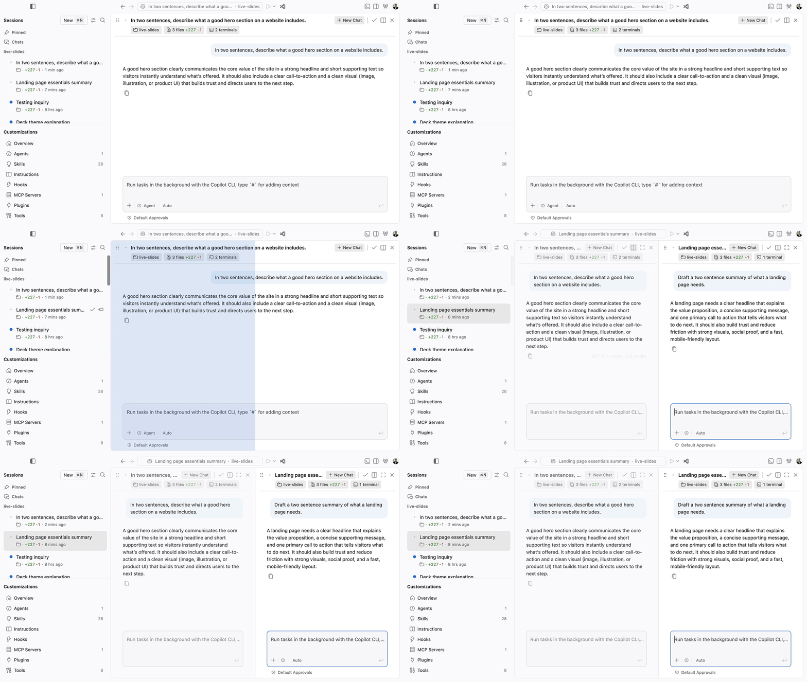
[Watch the MP4](https://github.com/eli-w-king/vscode-ux-research-media/blob/master/side-by-side/variant-a-drag-dock.mp4)
### Variant B. Split view control
No grip. Instead the header offers an explicit layout control labeled **"Add to Split View"** (a layout/columns icon), which toggles to **"Remove from Split View"** once the panel is kept in the split. This separates the "lock into a layout" idea from the favorite-style "pin".
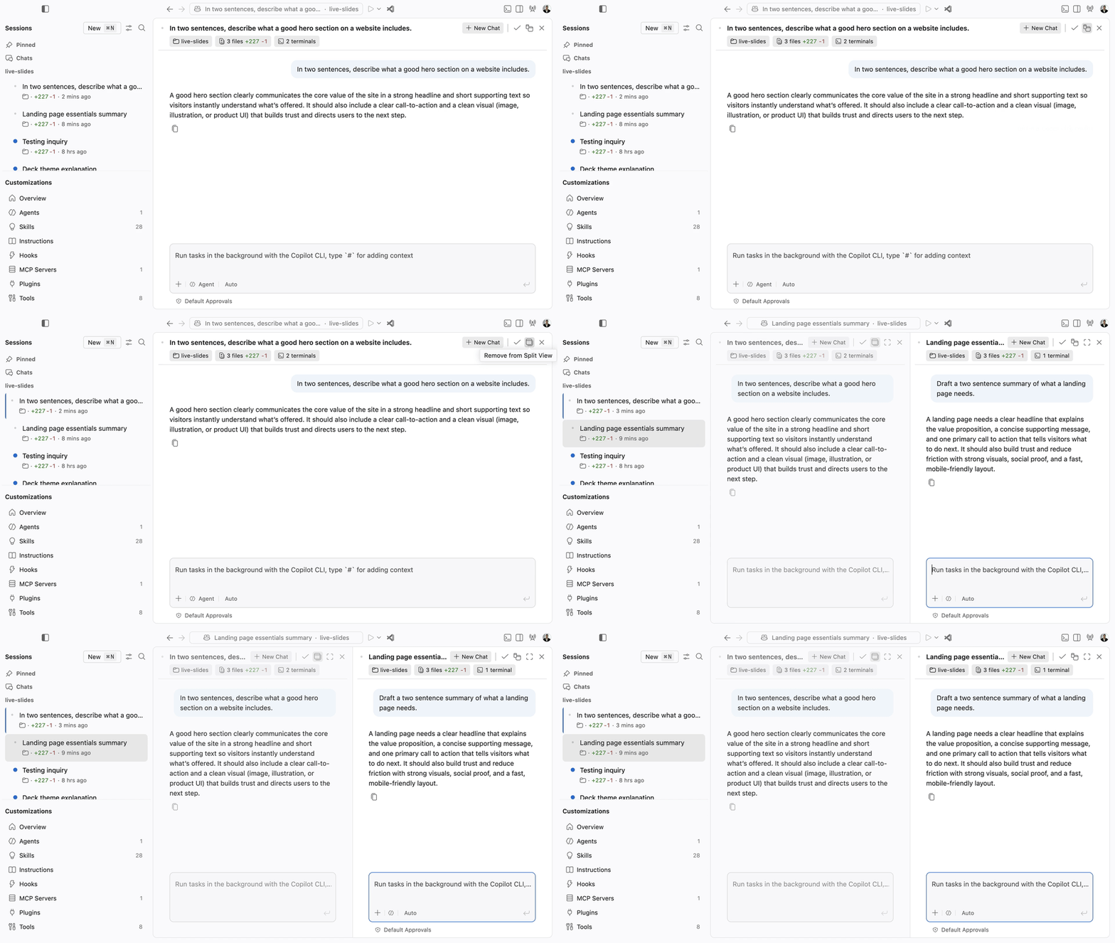
[Watch the MP4](https://github.com/eli-w-king/vscode-ux-research-media/blob/master/side-by-side/variant-b-split-view.mp4)
For contrast: the current "Pin" behavior
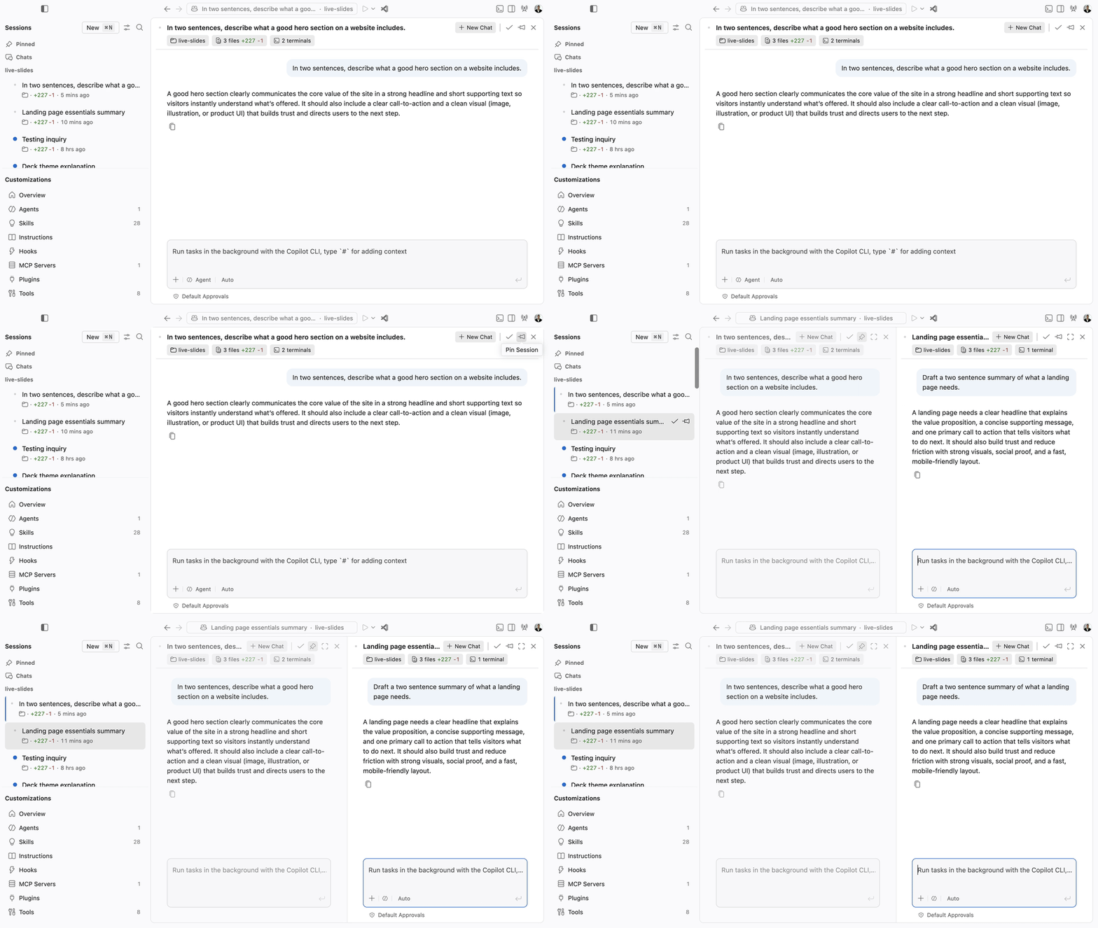
[Watch the MP4](https://github.com/eli-w-king/vscode-ux-research-media/blob/master/side-by-side/baseline-pin.mp4)
## Recommendation
The research **validates the direction** (arranging chats side by side is wanted and felt easy) but says the win is not "pick variant A or B", it is **fix the affordance details both share**. Concretely:
1. **Converge on one explicit, labeled control**, the **"Split view"** metaphor from Variant B, but drawn with the **single-window-with-a-divider icon** from Variant A (participants said that shape read clearest), and keep the current pin/list meaning separate.
2. **Keep drag-to-arrange too.** Participants wanted both a one-click button and drag, not one or the other.
3. **Add text, not just icons.** Icon-only controls were the biggest comprehension barrier; a visible label or clearer tooltip on first use would remove most of the confusion.
4. **Fix the "double-stacking" of icons** when more than one chat is open, which was the single most-cited confusion.
This is a refinement of the existing prototypes, not a new direction, so no redesign beyond the above is proposed here.
## What we heard (5 of 5 participants)
**1. Icon-only controls were the main comprehension barrier.** Most participants guessed at the buttons and asked for words. Some misread the workspace chips (live-slides, files, terminals) as the arrangement controls, and several defaulted to "New Chat" because it was the only labeled action.
> "Give me buttons that have words on them." (P77)
> "close, like cancel, pin, accept, new chat. That's my best guess from right to left." (P77)
**2. The split/divider icon read clearer than the two-separate-windows icon.** This was the most specific and repeated design signal.
> "the icon that appears to be shaped as one window with a line down the middle is clearer than the two separate windows of different sizes." (P77)
**3. The drag grip is recognized as a handle, but points people at list reordering, not side-by-side.** Some read it correctly; more than one associated the six dots with vertical ordering.
> "the six dots on the left clearly look like a means to prioritize items in a list ... not something I would normally think is used to split chats into two side-by-side windows." (P77)
> "these little dots are to move the chat around ... to the right ... to the left." (P9)
**4. People want both one-click and drag.**
> "I like the fact of being able to drag one chat ... and I also like the quick option to set the chats side by side by just clicking one button ... there should probably be an option to keep both." (P9)
**5. Ease was moderate-to-high; most rated it 6 or higher out of 7.** Reported numbers clustered around 6, with one 7 and one 5.
> "very easy ... a seven ... the buttons show the picture of the two squares side by side." (P9)
> "six out of seven ... looks pretty easy for the most part." (P67)
**6. Top confusion: icons "double-stack" when two chats are open.**
> "I don't love the double stacking of those icons when two chats were open. There's not enough differentiation." (P77)
## A vs B
Directional (small n), but clear: **neither variant won outright, and that is the finding.** Preference split across participants (some picked the one-click button, some the drag, some saw them as equivalent), while the concrete, agreed-upon signal was about the **icon shape and labeling**, not the metaphor. The recommendation above therefore merges B's explicit labeled control with A's clearer divider icon and keeps A's drag.
## Signals from usage
- **Most participants already run multiple agent/chat sessions at once today**, via separate windows or by switching between work and personal AI tools, and described side-by-side as matching how they already work. This is behavioral data from the study itself.
- **Product telemetry note:** a dedicated pull for this surface is still pending (the Agents-window session events are new and largely Insiders-gated, and the query run was blocked by network access at the time of writing). Directionally, side-by-side and split layouts are a well-worn pattern in the classic workbench, which is consistent with the appetite participants described. I will fold in the exact, approximated telemetry once the query can run.
## Options to try
These are developer/experimental prototypes for research, gated behind a dev command, not shipped UI. Switch between them live via the Command Palette: **Developer: Cycle Agents Side-by-Side Affordance (A/B)**.
| | Current | Variant A (Drag to dock) | Variant B (Split view) |
| --- | --- | --- | --- |
| Header control | "Pin Session" (pin icon) | "Dock Side by Side" (split-columns icon) | "Add to Split View" / "Remove from Split View" (layout icon) |
| Drag affordance | none visible | grip handle on each panel header | none |
| Metaphor | pin (overlaps the list "pin") | spatial docking + drag | lock into a layout |
Both variants call the same underlying "keep this session in the grid" behavior, so only the affordance (icon, label, tooltip, and the grip) changes. The drag-to-place-side-by-side flow already works today; Variant A mainly makes it discoverable.
## Method and caveats
- Think-out-loud study, **5 of 5 participants complete**, audience: people who code or vibe code and use AI assistants inside an editor.
- Stimulus was static, high-resolution screenshots of a real Code OSS build (not mockups). Several participants noted they could give sharper feedback with a hands-on, clickable build, so treat the specifics as directional.
- Small n, so preferences are directional, not statistically significant.
- Study: https://app.usertesting.com/workspaces/408945/test/9fa2dfd5-b498-4ba4-86c7-20d12b3d2785
cc @eli-w-king @jo-oikawa
Contributor guide
Assessment
This issue has not been assessed yet.