microsoft / microsoft/SandDance
Trendline to better understand data distribution
Nobody has claimed this yet.
- Dominant language
- TypeScript
- Stars
- 7.1k
- Forks
- 573
- Avg merge
- 8d 9h
- Merged PRs (30d)
- 4
Description
I have a scatterplot of randomly sampled algorithm configurations:
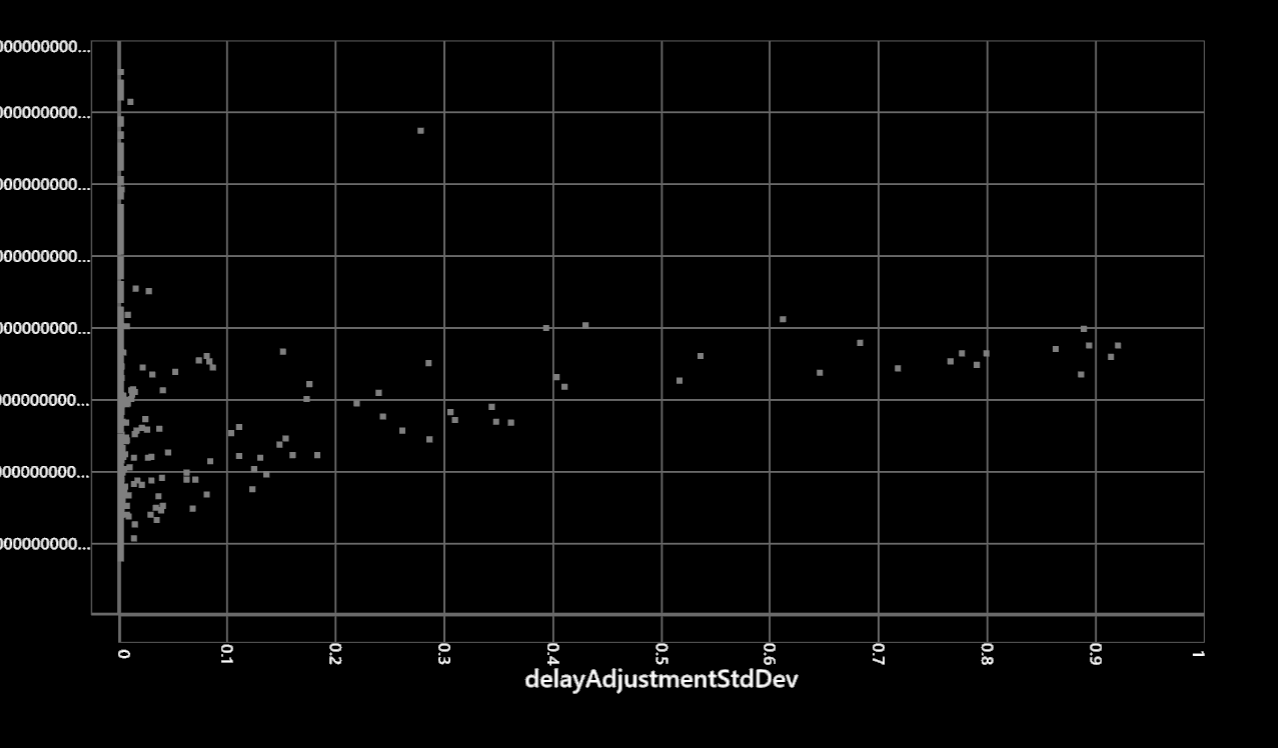
It's difficult to see what happens with all the closely aligned points at the left. To better understand where the optimum lies, I'd like to have the ability to add a trendline (2nd degree polynomial function).
Contributor guide
No contributing guide indexed for this repository
First steps
- Read the whole issue, then the project's contributing guide.
- Comment on the issue to say you are picking it up — it saves two people doing the same work.
- Fork the repository and make your change on a branch.
- Open a pull request that references the issue number.
Research direction
The issue names no file, test, or entry point. Start by locating the scatterplot implementation in the TypeScript project and tracing how sampled algorithm configurations are rendered. Done means users can add a second-degree polynomial trendline and use it to inspect where the optimum lies, with the existing scatterplot behavior preserved.
Written by the indexing model from the issue text.
Assessment
- Tech stack
- typescript
- Domain
- data-visualization
- Issue type
- Feature
- Difficulty
- 4/5
- Estimated time
- 3-5 days
- Activity status
- Stale
- Clarity
- Mostly clear
- Newbie friendliness
- 35/100