microsoft / microsoft/PowerBI-visuals-RadarChart
It seems when Y Axis have Decimal and Percent values it does not show correctly
Nobody has claimed this yet.
- Dominant language
- TypeScript
- Stars
- 39
- Forks
- 52
- PR merge metrics
- No merged PRs in 30d
Description
Hi there,
When formatting both Y Values to Percent it shrink to the middle:

When formatting one of the values to decimal, it shows more correctly:
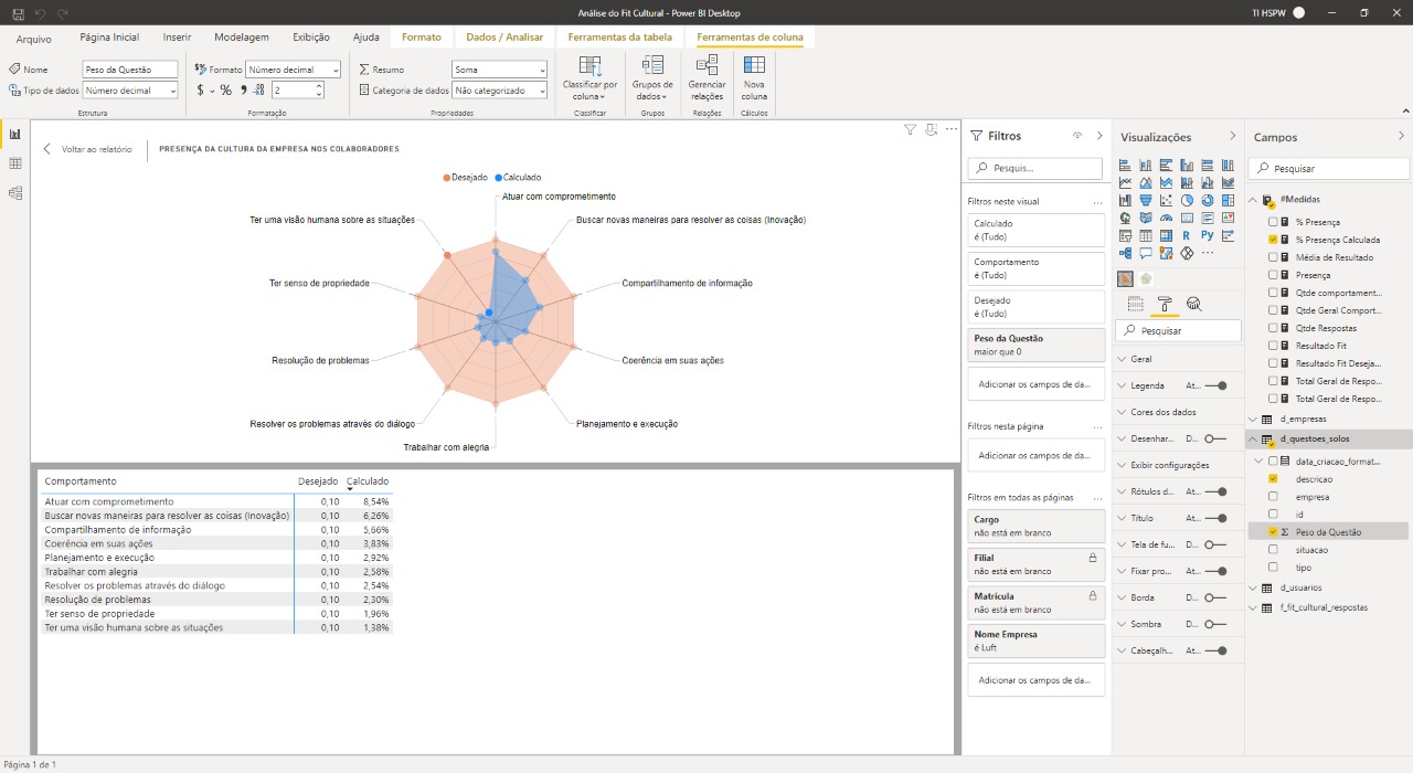
It seems that there is some fixed value in relation to the opening of the graph web ...
Or is there a way around this situation that I have demonstrated?
Contributor guide
No contributing guide indexed for this repository
First steps
- Read the whole issue, then the project's contributing guide.
- Comment on the issue to say you are picking it up — it saves two people doing the same work.
- Fork the repository and make your change on a branch.
- Open a pull request that references the issue number.
Research direction
Reproduce the Radar Chart with both Y values formatted as percentages, then compare it with the case where one value uses decimal formatting. Identify why the percentage configuration causes the chart to shrink toward the middle, and consider the issue complete when both formatting configurations render correctly without a fixed-size distortion.
Written by the indexing model from the issue text.
Assessment
- Tech stack
- typescript
- Domain
- data-visualization
- Issue type
- Bug
- Difficulty
- 4/5
- Estimated time
- 3-5 days
- Activity status
- Stale
- Clarity
- Needs clarification
- Newbie friendliness
- 28/100