microsoft / microsoft/AzureTRE
UI: Tweaks to make mobile friendly
Nobody has claimed this yet.
- Dominant language
- Python
- Stars
- 235
- Forks
- 192
- Avg merge
- 1d 23h
- Merged PRs (30d)
- 13
Description
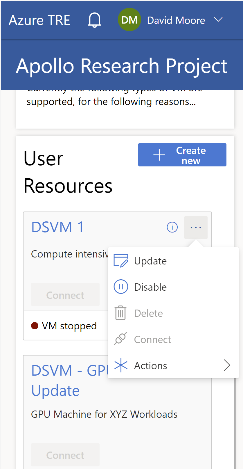
To be clear: it's not foreseen that the UI will be used on mobile devices at all. That said, there are some basic tweaks we can make so the UI is more functional and the user can access the features they might need - such as switching off a VM.
Most of the components we've used are mobile-ready and respond really well to the smaller screen size.
- Change the title in the header bar to "Azure TRE" when the page width < 640px
- Make the left nav bar (in the root and the workspace view) collapse left when the page width is < 640px and replace with either a hamburger icon in the top left, or a floating menu icon beneath the main blue bar, that would pull the left nav out.
We should end up with something like:
Contributor guide
First steps
- Read the whole issue, then the project's contributing guide.
- Comment on the issue to say you are picking it up — it saves two people doing the same work.
- Fork the repository and make your change on a branch.
- Open a pull request that references the issue number.
Research direction
The issue names the header bar and left navigation in the root and workspace views as the entry points; start by locating those responsive UI components and checking behavior below 640px. Done means the header uses the requested compact title and the navigation can collapse and be reopened on narrow screens, with the menu control verified on both views.
Written by the indexing model from the issue text.
Assessment
- Domain
- frontend
- Issue type
- Feature
- Difficulty
- 3/5
- Estimated time
- 1-2 days
- Activity status
- Stale
- Clarity
- Mostly clear
- Newbie friendliness
- 35/100