microsoft / microsoft/AdaptiveCards
[Accessibility] Description text on landing page barely readable
Open
Nobody has claimed this yet.
Area-Accessibility
Request
- Dominant language
- C#
- Stars
- 2k
- Forks
- 595
- Avg merge
- 1d 19h
- Merged PRs (30d)
- 1
Description
Problem Statement
In some sections on the landing page the text (on macOS) is barely readable. This is an accessibility problem.
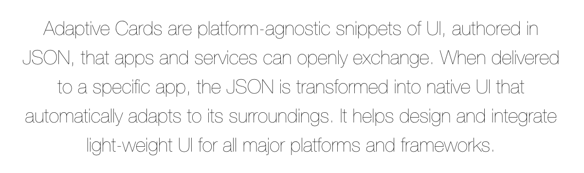
Proposed solution
You should consider using a thicker font-weight, e.g. normal instead of lighter:

Alternatives or Workarounds
No response
Contributor guide
First steps
- Read the whole issue, then the project's contributing guide.
- Comment on the issue to say you are picking it up — it saves two people doing the same work.
- Fork the repository and make your change on a branch.
- Open a pull request that references the issue number.
Research direction
Start at the Adaptive Cards landing page and inspect the styles for the sections shown in the screenshots, focusing on their font-weight. Confirm the current rendering on macOS, adjust the text weight for readability, and verify that the affected landing-page text is visibly legible without harming the surrounding design.
Written by the indexing model from the issue text.
Assessment
- Tech stack
- css
- Domain
- accessibility, frontend
- Issue type
- Bug
- Difficulty
- 2/5
- Estimated time
- 1-3 hours
- Activity status
- Stale
- Clarity
- Mostly clear
- Newbie friendliness
- 35/100