Explore the vertical centering of radio buttons & checkboxes to their labels
- Dominant language
- TypeScript
- Stars
- 53
- Forks
- 63
- Avg merge
- 2d 4h
- Merged PRs (30d)
- 15
Description
## Summary
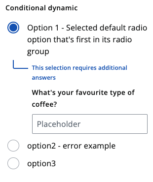
Currently, in `` & ``, the radio & checkbox icons are vertically aligned to the centre of the label. Where are multiple radio options / checkboxes and one label wraps onto multiple lines whilst others are on a single line, there's a visual difference. This visual difference is even more obvious when radio options are displayed horizontally.

If all radio button & checkbox icons were to be aligned to the top of the label, this would present an issue visually in the conditional variants.
## 💰 Use value
Visually, these two components would look better. This work could also reduce mental load on our customers as it could mean that radio buttons & checkboxes are always in the same location regardless of its label's length.
Contributor guide
Research direction
Start by locating the TypeScript implementations and examples for and , then compare vertical alignment in single-line, wrapped, horizontal, and conditional variants. Review the supplied screenshots and document or test the chosen behavior so both components remain visually consistent across label lengths.
Written by the indexing model from the issue text.
Assessment
- Tech stack
- typescript
- Domain
- design, frontend
- Issue type
- Feature
- Difficulty
- 3/5
- Estimated time
- 1-2 days
- Activity status
- Stale
- Clarity
- Mostly clear
- Newbie friendliness
- 42/100