material-components / material-components/material-components-android
[TimePicker] Support different styling for the Ok/Cancel buttons
Nobody has claimed this yet.
- Dominant language
- Java
- Stars
- 17.4k
- Forks
- 3.2k
- PR merge metrics
- No merged PRs in 30d
Description
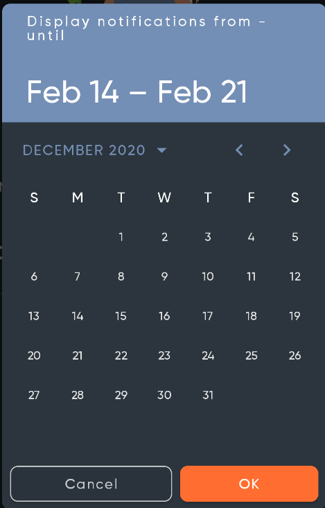
The date picker supports different styling of the ok/cancel buttons through it's buttonBarPositiveButtonStyle and buttonBarNegativeButtonStyle. Seems like the time picker does not, both buttons are styled with the same style: borderlessButtonStyle
Is there a way around this without using reflection? See below my desired styling of the picker buttons.

Contributor guide
First steps
- Read the whole issue, then the project's contributing guide.
- Comment on the issue to say you are picking it up — it saves two people doing the same work.
- Fork the repository and make your change on a branch.
- Open a pull request that references the issue number.
Research direction
Start by comparing the TimePicker and DatePicker button styling APIs, especially buttonBarPositiveButtonStyle and buttonBarNegativeButtonStyle, to locate where the TimePicker currently applies borderlessButtonStyle. Confirm the work is done when Ok and Cancel can receive separate styles without reflection and the existing DatePicker behavior remains consistent.
Written by the indexing model from the issue text.
Assessment
- Tech stack
- android, java
- Domain
- mobile
- Issue type
- Feature
- Difficulty
- 3/5
- Estimated time
- 1-2 days
- Activity status
- Stale
- Clarity
- Mostly clear
- Newbie friendliness
- 38/100