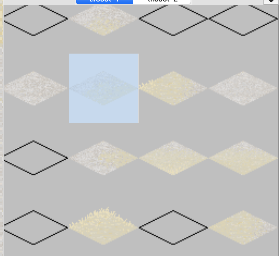
Current tileset selection colour hides too much tile detail
Nobody has claimed this yet.
- Dominant language
- C++
- Stars
- 12.9k
- Forks
- 2k
- Avg merge
- 4h 27m
- Merged PRs (30d)
- 8
Description
It's hard to see which tile is selected (when the tiles themselves are not easily distinguishable from one another) because the selection colour is very opaque. It would be good to be able to specify the opacity of the selection colour, or have a setting that strokes the selected tile instead of filling it when enabled.
Contributor guide
First steps
- Read the whole issue, then the project's contributing guide.
- Comment on the issue to say you are picking it up — it saves two people doing the same work.
- Fork the repository and make your change on a branch.
- Open a pull request that references the issue number.
Research direction
The issue does not name a file, test, or entry point. Start by locating the tileset editor's selected-tile rendering, then determine how selection colour and tile detail are currently handled. Done means either configurable selection opacity or an optional stroked selection, with the behaviour matching the requested visual distinction.
Written by the indexing model from the issue text.
Assessment
- Tech stack
- cpp
- Domain
- design, desktop
- Issue type
- Feature
- Difficulty
- 4/5
- Estimated time
- 3-5 days
- Activity status
- Stale
- Clarity
- Mostly clear
- Newbie friendliness
- 35/100