mapbox / mapbox/mapbox-gl-geocoder
Media query bug in mapbox-gl-geocoder.css? (Input field too big on mobile)
Nobody has claimed this yet.
- Dominant language
- JavaScript
- Stars
- 388
- Forks
- 181
- PR merge metrics
- No merged PRs in 30d
Description
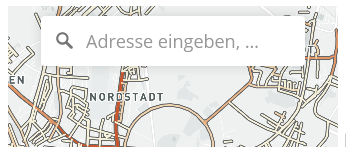
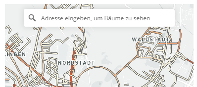
Are the media queries in [mapbox-gl-geocoder.css](https://github.com/mapbox/mapbox-gl-geocoder/blob/master/lib/mapbox-gl-geocoder.css) supposed to be for mobile devices? Then `@media screen and (min-width: 640px)` makes no sense.
Input field on mobile devices with `@media screen and (min-width: 640px)`
Input field on mobile devices with media query changed to `@media (max-width: 640px)`
Contributor guide
First steps
- Read the whole issue, then the project's contributing guide.
- Comment on the issue to say you are picking it up — it saves two people doing the same work.
- Fork the repository and make your change on a branch.
- Open a pull request that references the issue number.
Research direction
Open lib/mapbox-gl-geocoder.css and inspect the media-query rules affecting the input field. Reproduce the mobile layout described in the issue, then verify the breakpoint behavior on mobile and wider screens so the input is appropriately sized in both cases.
Written by the indexing model from the issue text.
Assessment
- Tech stack
- css
- Domain
- frontend
- Issue type
- Bug
- Difficulty
- 1/5
- Estimated time
- Under an hour
- Activity status
- Stale
- Clarity
- Clearly specified
- Newbie friendliness
- 45/100