[bug]: Header/top bar not responsive on mobile (overflows horizontally) — self-hosted v1.3.1
Nobody has claimed this yet.
- Dominant language
- TypeScript
- Stars
- 59.6k
- Forks
- 5.8k
- Avg merge
- 1d 22h
- Merged PRs (30d)
- 49
Description
Note: This issue was researched and written by an AI assistant (Claude Code) on my behalf, and verified against a live self-hosted instance. — @jrbromberg
Describe the bug
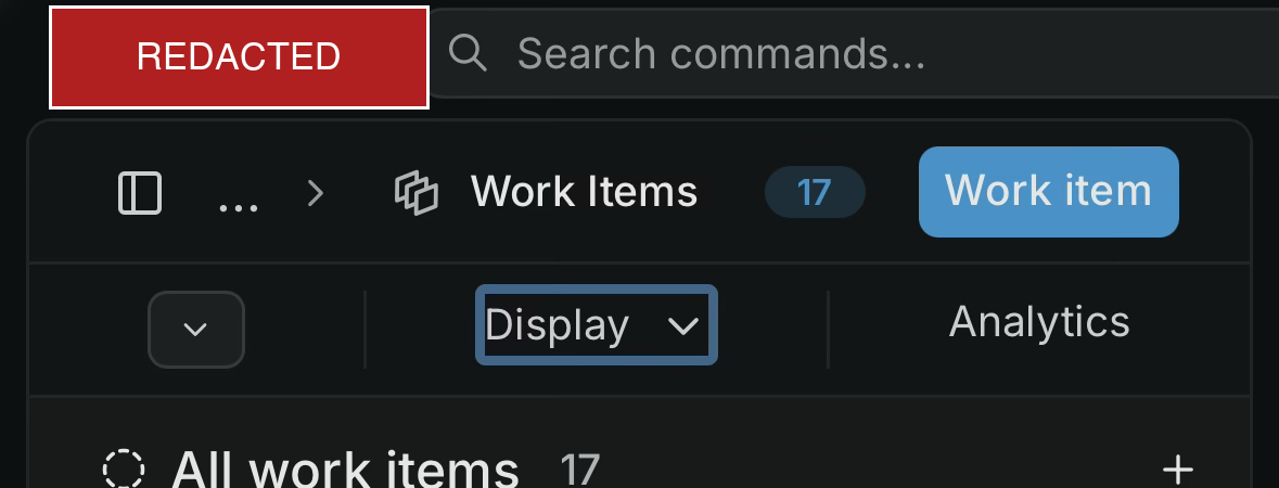
On mobile (iOS, WebKit), the top bar of a project's Work Items view is not responsive. The workspace switcher + "Search commands…" field + the Work Items / Display / Analytics controls render at desktop widths and overflow horizontally past the viewport instead of collapsing into a mobile layout. The search field and right-side controls are cut off / require horizontal scrolling.
The issue list content itself loads and renders fine — this is specifically the header/top-bar layout on narrow screens.
Steps to reproduce
- Self-host Plane CE v1.3.1.
- Open a project's Work Items (issues) view in a mobile browser (iOS Safari/Chrome, ~390px wide).
- Observe the top bar overflowing horizontally; controls extend beyond the screen edge.
Expected behavior
The header/top bar collapses responsively on narrow viewports (e.g. condensed controls or an overflow menu), staying within the viewport width.
Environment
- Plane: self-hosted Community Edition v1.3.1 (Docker Compose)
- Device/browser: iPhone, iOS 26 (WebKit — both Safari and iOS Chrome)
- Accessed over the network via a browser (not the native app)
Screenshot
Mobile view of the Work Items top bar — the "Search commands…" field and the Work Items / Display / Analytics controls overflow the ~390px viewport instead of collapsing.
Contributor guide
First steps
- Read the whole issue, then the project's contributing guide.
- Comment on the issue to say you are picking it up — it saves two people doing the same work.
- Fork the repository and make your change on a branch.
- Open a pull request that references the issue number.
Research direction
Start by reproducing the Work Items view at roughly 390px width on a mobile browser, then trace the header/top-bar entry point and its workspace switcher, command search, and Work Items/Display/Analytics controls. Compare the layout at narrow and desktop widths; done means the complete top bar stays within the viewport without horizontal scrolling while its controls remain usable.
Written by the indexing model from the issue text.
Assessment
- Tech stack
- react, typescript
- Domain
- frontend
- Issue type
- Bug
- Difficulty
- 3/5
- Estimated time
- 1-2 days
- Activity status
- Quiet
- Clarity
- Mostly clear
- Newbie friendliness
- 48/100