Box Plot Demo with single entry breaks graph
Nobody has claimed this yet.
- Dominant language
- JavaScript
- Stars
- 10.5k
- Forks
- 463
- PR merge metrics
- No merged PRs in 30d
Description
I'm using the Box Plot demo you've provided to display some summary statistics for some data. There's a case where there may only be a single entry to display in the graph, but the result doesn't display the box correctly nor does the x-axis even get displayed. Example: https://jsbin.com/qesexajura/edit?js,output
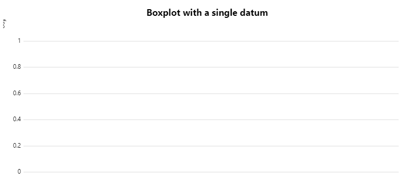
Adjusting scales.x.distr from 2 to 1 correctly displays the box and x-axis, though with a bunch of padding to the right which unnecessarily fills the graph.
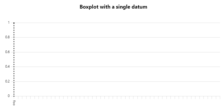
Hovering over the graph displays the highlight/legend plugin values for the single entry though. Is there some other adjustments needed here to account for single-element datasets with the box plot plugin?
Contributor guide
No contributing guide indexed for this repository
First steps
- Read the whole issue, then the project's contributing guide.
- Comment on the issue to say you are picking it up — it saves two people doing the same work.
- Fork the repository and make your change on a branch.
- Open a pull request that references the issue number.
Research direction
Start with the Box Plot demo and reproduce the single-entry case from the linked JSBin. Compare the behavior with scales.x.distr set to 2 and 1, including the missing x-axis, box rendering, and excess right padding. Done means a single-element dataset displays its box and x-axis without unnecessary padding while preserving the hover highlight and legend values.
Written by the indexing model from the issue text.
Assessment
- Tech stack
- javascript
- Domain
- data-visualization
- Issue type
- Bug
- Difficulty
- 3/5
- Estimated time
- 1-2 days
- Activity status
- Stale
- Clarity
- Mostly clear
- Newbie friendliness
- 38/100