Font width looks off
Nobody has claimed this yet.
- Dominant language
- Rust
- Stars
- 38.9k
- Forks
- 1.3k
- Avg merge
- 19m
- Merged PRs (30d)
- 1
Description
Lapce Version
v 0.2.0
System information
Windows 10
##Description
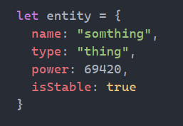
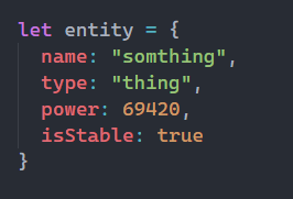
I have compared how the code looks in Lapce and VS Code and noticed that it looks slightly thinner in Lapce and even some characters like 'u' look a little distorted, which isn't a huge issue but feels annoying to me.
NOTE : Font size was set to the same value in both editors (18)
Lapce
VSCode
Contributor guide
First steps
- Read the whole issue, then the project's contributing guide.
- Comment on the issue to say you are picking it up — it saves two people doing the same work.
- Fork the repository and make your change on a branch.
- Open a pull request that references the issue number.
Research direction
No source file, test, or entry point is identified. Reproduce the font comparison on Windows 10 with Lapce v0.2.0 and VS Code at size 18, then trace the editor's font-rendering path. Done means the reported thinness and distorted characters are resolved or the rendering difference is clearly diagnosed and covered by an appropriate test.
Written by the indexing model from the issue text.
Assessment
- Tech stack
- rust
- Domain
- desktop
- Issue type
- Bug
- Difficulty
- 4/5
- Estimated time
- 3-5 days
- Activity status
- Stale
- Clarity
- Needs clarification
- Newbie friendliness
- 25/100