Fixing the "add new device" flow
- Dominant language
- Go
- Stars
- 9.2k
- Forks
- 1.3k
- Avg merge
- 12h 58m
- Merged PRs (30d)
- 56
Description
Let's improve the confusing Keybase client UI when a user sets up a new device.
Here's what currently happens
User gets a new computer. They install Keybase on the new computer and launch it. It asks them to login. They enter their Keybase username and are presented with a list of their existing Keybase devices asking what device the user wants to connect with.
# The first challenge, understanding provisioning
This is a new experience for a user. They've probably never encountered a piece of software that, when installed on a second device, requires the user to do something on the first device to allow them to log in. They're likely expecting to be prompted, after entering their username, for their Keybase passphrase.
We should guide the user through this foreign experience. We should either add text to this screen or some kind of a question mark/tooltip/pop up with an explanation of how this provisioning process works (and how it will involve another existing device they control)
# The second challenge, naming a device
From here the user chooses their existing device from the list, let's say their computer.
The user is prompted to `Set a public name for this device`
This text could be more clear. It's ambiguous at this point if `this device` refers to the device they just chose in the previous screen (e.g. their other computer) or if it means the device they're sitting at and looking at the screen of.
This could be improved by replacing `this device` with `this new device`
The user hopefully figures out that this is asking them to set the name of this new device and they enter a name.
# The third challenge, leaving the flow and moving to another device
The user is then taken to the next screen which says
```
Type in text code
In the Keybase app on your computer, go to Devices > Add new...
```
followed by what looks like a new paper code passphrase
This screen is confusing. First, this is likely the first time a user has had to, during a login process to an app or website, pause their login flow, step away from the device they're working on, go to a different device, and transcribe text from the first device into the second device. Since this will be the first time the user likely has ever done this, we should add clarifying text or a question mark/tooltip/pop up with an explanation of what the user needs to do here.
The phrase `Type in text code` is confusing and terse.
The term `your computer` is ambiguous here. Does this mean the computer the user is sitting at as confused @mbruzek in #9665? Does it mean the new device the user is setting up? This should be more verbose and explicitly communicate that the user is expected to go to the other device and transcribe the text being displayed.
# The fourth challenge, the other device's `Add new` interface
The user goes to their other device, let's say another computer, opens Keybase, navigates to `Devices` and clicks `Add new`
The user chooses the device type, for example `New computer`
At this point the user is taken to a screen that looks very similar to the screen that's still up on their new device.
It says
```
Type in text code
In the Keybase app on your computer, go to Devices > Add new...
```
followed by what looks like a different new paper code passphrase except this one isn't in English and appears to be made of made up words.
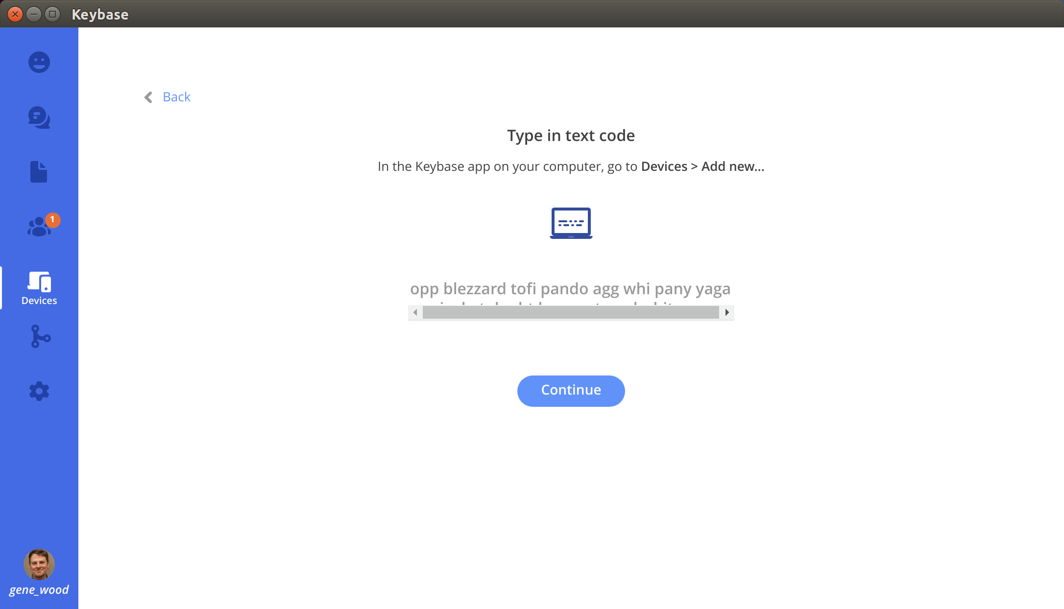
The passphrase is too long to fit in the space provided so it wraps but appears to be in some kind of "iframe" type inner section so it added a horizontal scroll bar which overlaps the remainder of the passphrase so it's not visible. And this passphrase isn't selectable so it can't be copy pasted so the user can see the whole thing which wrapped below the scrollbar.
There is a `Continue` button
When the user clicks the `Continue` button nothing happens
1. The extreme similarity between the screen on the new device that the user started at and the screen at the other device that they're at now, combined with the very subtle differences (the passphrase is different, the passphrase is made up words instead of real words, the continue button, the color of the passphrase text) is very confusing. Since these screens are fundamentally different (one is providing the user information and one is expecting the user to type information in. One is the sender and one is the recipient), they should more clearly be differentiated from each other. They should be obviously different not subtly different.
2. There needs to be text on this screen or a question mark/tooltip/pop up that explains to the user that the thing they're expected to do on this screen is read the passphrase from their new device and type it into the textbox.
3. The input textbox needs to be fixed.
a. The size of the textbox needs to be changed to the size of the passphrase
b. The UI of the textbox needs to make it clear that it's an input textbox. This should be done by removing the sample passphrase.
c. The sample passphrase that's prefilled into the textbox in gray needs to be reworked. As @warner mentions in #5803, "I was uncertain about the flow, maybe because of the fake code grayed-out in the code-entry field on the old compute". I was also caught by this UI bug. The sample passphrase should be removed and instead text added outside the textbox explaining that this is where the user is meant to transcribe the passphrase from the new device. Alternatively, the font color needs to be made much much lighter to make it clear this is not a passphrase. Ideally however it's just removed.
d. The "iframe" container for the textbox needs to be reworked so it doesn't result in wrapping and scrollbars which obscure the contents of the textbox
4. When the user clicks the `Continue` button and they've entered no passphrase into th input textbox, a message should pop up clarifying what's expected of the user. A user clicking `Continue` with no passphrase entered is a strong signal that they don't understand what they're supposed to do.
I understand why the UI is the way it is currently, it conforms to the minimalist stripped down UI of the Keybase client, but in this case, this is way to minimalist and it needs to be made more clear to help users through the flow.
Contributor guide
No contributing guide indexed for this repository
Research direction
Start at the Keybase Devices > Add new flow and compare the new-device and existing-device screens described in the issue. Review the provisioning, device naming, text-code entry, and Continue states before deciding on the UI changes. Done means the flow clearly explains which device to use, provides an unambiguous code input, displays the full passphrase, and responds when Continue is pressed without input.
Written by the indexing model from the issue text.
Assessment
- Tech stack
- go, react, react-native
- Domain
- frontend
- Issue type
- Bug
- Difficulty
- 5/5
- Estimated time
- Over a week
- Activity status
- Stale
- Clarity
- Mostly clear
- Newbie friendliness
- 25/100