Many views are hard to read, please increase UI contrast
- Dominant language
- Go
- Stars
- 9.2k
- Forks
- 1.3k
- Avg merge
- 12h 58m
- Merged PRs (30d)
- 56
Description
The light grey on white is not really eye-friendly. I wish there was a way for Keybase to respect the accessibility settings in macOS, but nothing happens in the app when I change my settings:
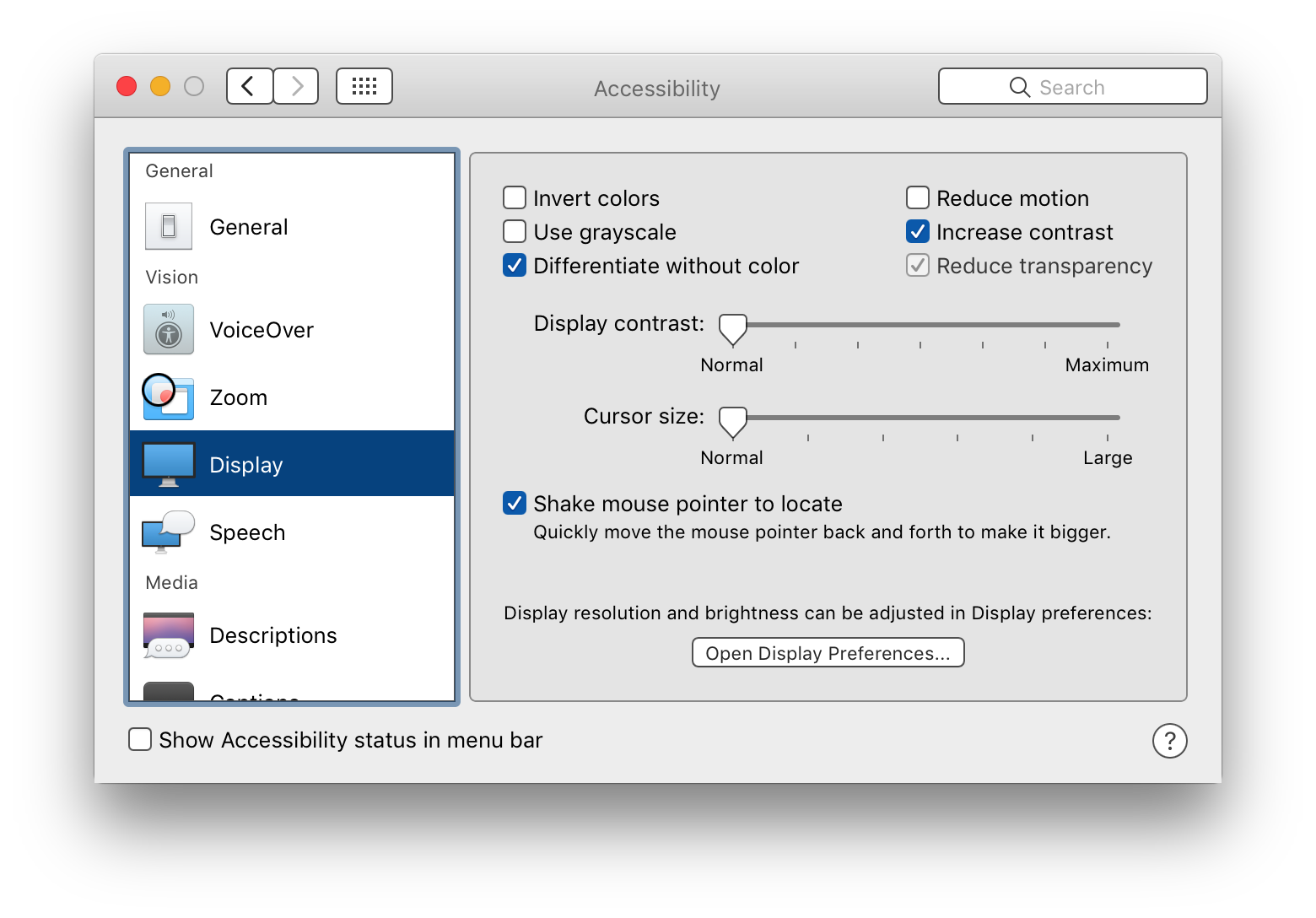
Please [consider a contrast ratio of over 4.5:1](https://developer.apple.com/macos/human-interface-guidelines/visual-design/color/).
It is especially hard to read the chat and drop-down.
Contributor guide
No contributing guide indexed for this repository
Research direction
Start by inspecting the chat and drop-down views, then check how the app handles macOS accessibility settings. Compare their colors against the linked contrast guidance and verify that the affected UI reaches a contrast ratio above 4.5:1 and responds appropriately when the relevant macOS setting changes.
Written by the indexing model from the issue text.
Assessment
- Tech stack
- macos
- Domain
- accessibility, desktop, frontend
- Issue type
- Feature
- Difficulty
- 4/5
- Estimated time
- 3-5 days
- Activity status
- Stale
- Clarity
- Mostly clear
- Newbie friendliness
- 35/100