Continuous Color Gradients
- Dominant language
- TypeScript
- Stars
- 12k
- Forks
- 2k
- Avg merge
- 1d 5h
- Merged PRs (30d)
- 66
Description
**Is your feature request related to a problem? Please describe.**
I often work with graduated datasets (e.g. ocean temperature) and Kepler.gl has been a great WebGL platform for quickly visualising a lot of these sorts of variables, so first and foremost, thanks for putting together a great platform!
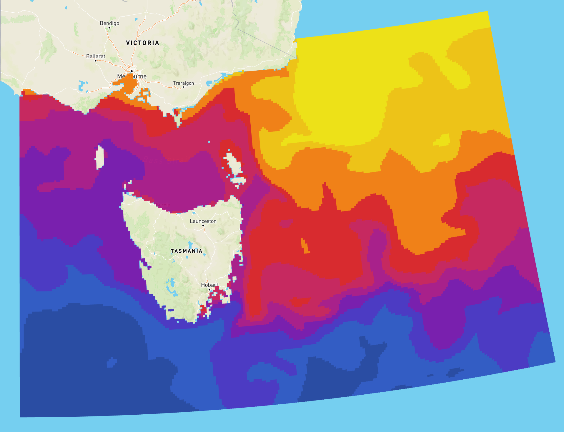
By default, Kepler 'bins' the color variables according to the chosen spectrum and/or manually colored step intervals. Although great for qualitative data, this approach often hides subtle fluctuations in data values in quantitative data if the bounds around each color 'step' are not small enough.
**Describe the solution you'd like**
It would be fantastic if Kepler could also support the selection of a pre-defined continuous [sequential](https://matplotlib.org/3.1.0/_images/sphx_glr_colormaps_002.png), [diverging](https://matplotlib.org/3.1.0/_images/sphx_glr_colormaps_004.png), [cyclic](https://matplotlib.org/3.1.0/_images/sphx_glr_colormaps_005.png) and [miscellaneous](https://matplotlib.org/3.1.0/_images/sphx_glr_colormaps_007.png) color gradients, and Kepler would render the data values according to the chosen gradient. The linked gradient examples are standard across most packages for scientific data plotting/exploration (e.g. ArcGIS, QGIS, Matlab, Matplotlib etc). By default I would expect Kepler would use the min and max values of the dataset as the lower and upper bounds of the gradient, but also having the ability for the user to manually set the lower and upper bounds is amazingly powerful and essential for revealing finer-scale variations in quantitative data.
**Describe alternatives you've considered**
Color gradient RGB values could be calculated in advance and assigned as an additional data column to each data source, but currently there's no way of rendering pre-defined RGB or HEX values directly from the dataset. This approach also feels slightly cumbersome and 'hacky'.
**Additional context**
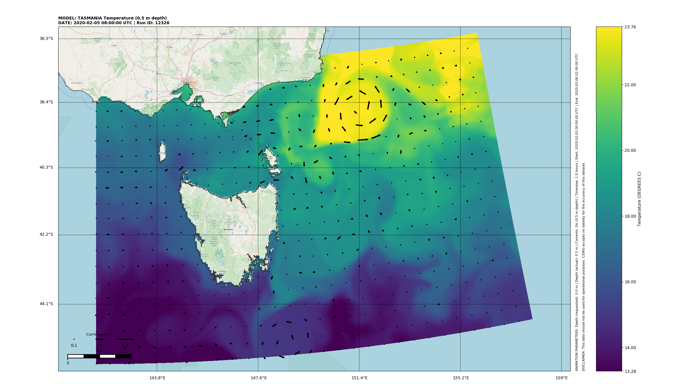
The following provides an example of one of my datasets plotted with a continuous 'Viridis' gradient in Python with min and max bounds of 11.18 and 18.88 respectively. You can clearly see finer scale variations in temperature patterns that aren't immediately obvious with the current 'stepped' color approach in Kepler.
The following illustrates a current example in Kepler using a 10-stepped colour gradient (different timestep and gradient, but clearly shows how the finer variations in temperature are lost):
Thanks in advance!
Contributor guide
No contributing guide indexed for this repository
Assessment
This issue has not been assessed yet.