UX: Timelime improvement
Open
- Dominant language
- TypeScript
- Stars
- 6.8k
- Forks
- 320
- PR merge metrics
- No merged PRs in 30d
Description
Here a small hint, that the UX could be improved.
I needed to think to understand that the upper rectangle marks the viewport for the middle part of the windows.
With other words, I needed some time to understand the pink arrow in this screenshot:
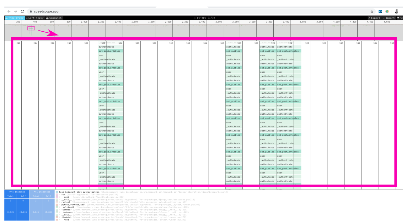
How could this get improved?
Maybe a different color for the rectangle would help. I hope you care for UX issues like this. And I guess you have a better idea how to fix this, than my idea.
Contributor guide
Assessment
This issue has not been assessed yet.