jenkinsci / jenkinsci/junit-plugin
[JENKINS-5538] Test result trend diagrams should be mirrored vertically because currently they suggest visually a deterioration when in fact test results improve
- Dominant language
- Java
- Stars
- 87
- Forks
- 351
- Avg merge
- 1d 19h
- Merged PRs (30d)
- 2
Description
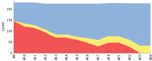
This would be a cosmetic change, but an important one. As seen on the attached Test Result Trend diagram, when the number of successful test cases rises, the diagram actually communicates the decreasing number of test failures.

This causes a subconscious impression of things deteriorating, instead of improving, so the diagram - when interpreted without additional context - communicates the opposite of the actual facts.

This applies mostly to pointy haired bosses, but to some amount to every human being, even the developers who know what the visualized data actually means.

The diagram should be mirrored vertically, with successful tests at the bottom, skipped in the middle and failing at the top. This way, when results improve, we'd see an upwards trend on the diagram.
---
Originally reported by olo, imported from: Test result trend diagrams should be mirrored vertically because currently they suggest visually a deterioration when in fact test results improve
Raw content of original issue
This would be a cosmetic change, but an important one. As seen on the attached Test Result Trend diagram, when the number of successful test cases rises, the diagram actually communicates the decreasing number of test failures.
This causes a subconscious impression of things deteriorating, instead of improving, so the diagram - when interpreted without additional context - communicates the opposite of the actual facts.
This applies mostly to pointy haired bosses, but to some amount to every human being, even the developers who know what the visualized data actually means.
The diagram should be mirrored vertically, with successful tests at the bottom, skipped in the middle and failing at the top. This way, when results improve, we'd see an upwards trend on the diagram.
1 attachment
- [hudson_test_result_trend.png](https://issues.jenkins.io/secure/attachment/19099/hudson_test_result_trend.png)
> 
Contributor guide
Assessment
This issue has not been assessed yet.