Graph visualization doesn't respect query range defined in flux query
- Dominant language
- TypeScript
- Stars
- 117
- Forks
- 51
- Avg merge
- 2d 15h
- Merged PRs (30d)
- 4
Description
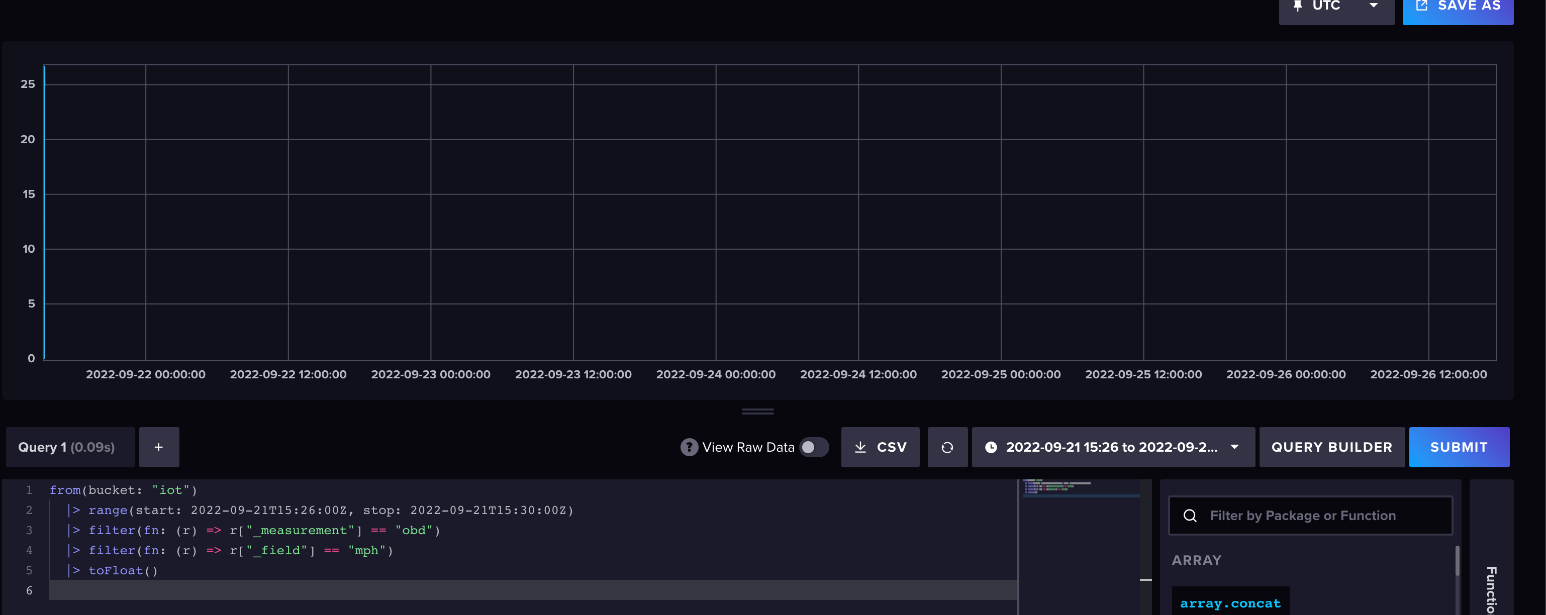
The graph visualization should respect the time range defined in the flux query.
Query:
```
from(bucket: "iot")
|> range(start: 2022-09-21T15:26:00Z, stop: 2022-09-21T15:30:00Z)
|> filter(fn: (r) => r["_measurement"] == "obd")
|> filter(fn: (r) => r["_field"] == "mph")
|> toFloat()
```
Graph doesn't respect the range:
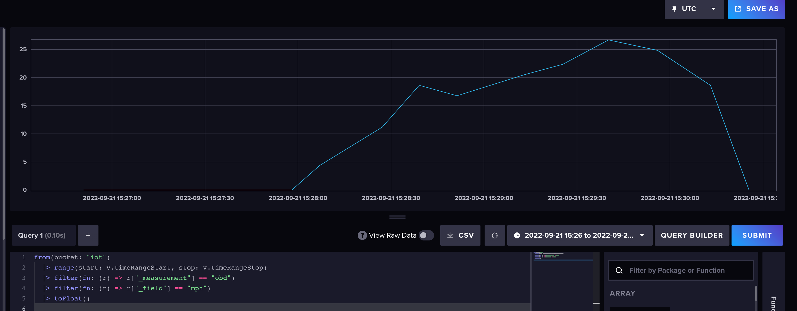
Change query to use custom time range dropdown:
```
from(bucket: "iot")
|> range(start: v.timeRangeStart, stop: v.timeRangeStop)
|> filter(fn: (r) => r["_measurement"] == "obd")
|> filter(fn: (r) => r["_field"] == "mph")
|> toFloat()
```
And now the visualization is correct:
## About your environment
**Environment info:**
- https://us-west-2-1.aws.cloud2.influxdata.com/
Contributor guide
No contributing guide indexed for this repository
Assessment
This issue has not been assessed yet.