Dashboard Usability: Graphs that override the dashboard's time selection should show an indicator
- Dominant language
- TypeScript
- Stars
- 117
- Forks
- 51
- Avg merge
- 2d 15h
- Merged PRs (30d)
- 4
Description
### Background
from Ryan:
>This has been bugging me today (as a user). I’m playing with some dashboards and really want the x-axis / time-axis to line up across all the cells. I’m setting some longer time ranges for the dashboard time range for which there is no data. The graphs have their x-axis set to `auto` .. which seems to prefer starting the axis when data is first available vs. starting it at the selected dashboard time range.
>
>This makes it much harder to compare the different dashboard cells (or even notice that the cell doesn’t cover the full time range selected for the dashboard.).
See [this slack link](https://influxdata.slack.com/archives/CLHATC50E/p1627415406346300) for the screenshot, since it contains information not intended for public consumption
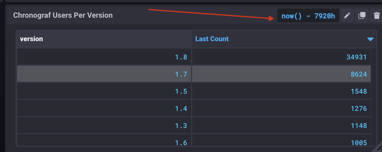
**Note** The actual issue is that several of the cells in the screenshot have overridden the dashboard time, but it isn't clear to the user. In 1.x, we had an indicator on the cell when the query was overriding the time:

### Acceptance Criteria
- When a graph has an overridden time range, it should show a visual indicator to the user
Contributor guide
No contributing guide indexed for this repository
Assessment
This issue has not been assessed yet.