influxdata / influxdata/influxdb
Data Explorer: Band visualization produces garbled output
- Dominant language
- Rust
- Stars
- 31.7k
- Forks
- 3.7k
- Avg merge
- 13h 37m
- Merged PRs (30d)
- 8
Description
__Steps to reproduce:__
1. Create a query resulting in the attached data: [2022-02-09-18-19_influxdb_data.csv](https://github.com/influxdata/influxdb/files/8037560/2022-02-09-18-19_influxdb_data.csv)
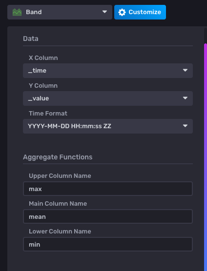
2. Set up a band visualization using the max, mean, and min results, like so:
3. Configure any aggregate window in the query, with similar results.
Here is the (redacted) query that generated the data:
```
// The source data provides separate fields for 95th, 50th, and 5th percentile
// named ch_95, ch_50, and ch_5.
// However, the same behavior occurs if only the 50th percentile field is used
// with the max, mean, and min agg functions.
// The field seems to need to be renamed to the same string for all of the results
// so that the band visualizer can pick up all 3 related result streams.
from(bucket: "temp2")
|> range(start: v.timeRangeStart, stop: v.timeRangeStop)
|> filter(fn: (r) => r["_measurement"] == "")
|> filter(fn: (r) => r["_field"] == ch_95)
|> aggregateWindow(every: agg, fn: max, createEmpty: false)
|> map(fn: (r) => ({r with _field: ch_50}))
|> yield(name: "max")
from(bucket: "temp2")
|> range(start: v.timeRangeStart, stop: v.timeRangeStop)
|> filter(fn: (r) => r["_measurement"] == "")
|> filter(fn: (r) => r["_field"] == ch_50)
|> aggregateWindow(every: agg, fn: mean, createEmpty: false)
|> yield(name: "mean")
from(bucket: "temp2")
|> range(start: v.timeRangeStart, stop: v.timeRangeStop)
|> filter(fn: (r) => r["_measurement"] == "")
|> filter(fn: (r) => r["_field"] == ch_5)
|> aggregateWindow(every: agg, fn: min, createEmpty: false)
|> map(fn: (r) => ({r with _field: ch_50}))
|> yield(name: "min")
```
__Expected behavior:__
The visualization creates a solid shaded region between the min and max bounds.
__Actual behavior:__
The vertices of the lower bound are scrambled as shown.
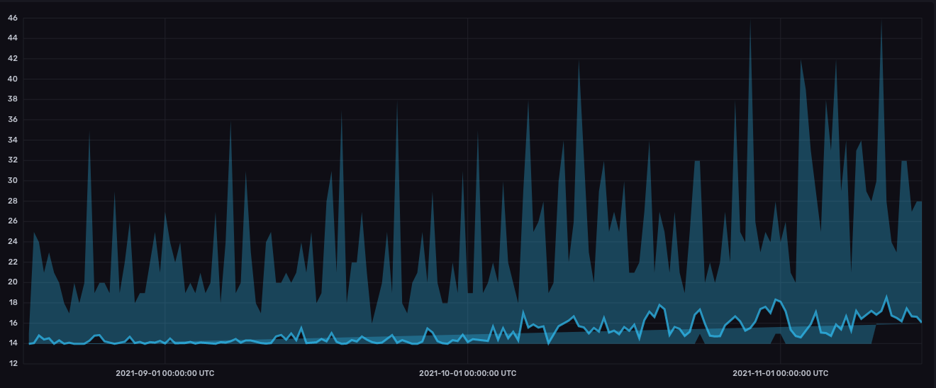
Most of my data sets produce correct-looking plots. Some of them look like this.
__Environment info:__
* System info: `Darwin 21.2.0 arm64`
* InfluxDB version: `InfluxDB 2.1.1 (git: 657e1839de) build_date: 2021-11-08T18:37:04Z` (installed from Homebrew)
__Config:__
Config is all default.
Contributor guide
Research direction
Reproduce the issue in the Data Explorer band visualization using the attached CSV and redacted query, including an aggregate window. Done means the visualization renders a solid shaded region between the minimum and maximum bounds without scrambled lower-bound vertices.
Written by the indexing model from the issue text.
Assessment
- Domain
- data-visualization, frontend
- Issue type
- Bug
- Difficulty
- 4/5
- Estimated time
- 3-5 days
- Activity status
- Stale
- Clarity
- Mostly clear
- Newbie friendliness
- 35/100