influxdata / influxdata/influxdb
[influxdb v2 - beta10] Need deterministic colors applied per series
- Dominant language
- Rust
- Stars
- 31.7k
- Forks
- 3.7k
- Avg merge
- 13h 37m
- Merged PRs (30d)
- 8
Description
I have 2 hosts that I'm pinging, and I chart the max and min separately.
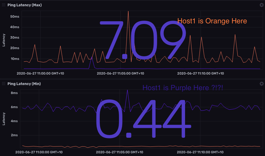
For some reason Chronograph inverts the colors applied within each cell, and I cannot figure out why.
It would appear that colouring is based on some internal key ID, instead of a controllable user definition. Ie. the same host, should always be the same colour in my use case.
use cases:
- per category / identity
- per statistic (eg. median, 95th, 99th percentile)
**Example1 - colors inverted plotting the same two hosts in separate cells:**
```
#For cell1 showing max response times
from(bucket: "test123")
|> range(start: v.timeRangeStart, stop: v.timeRangeStop)
|> filter(fn: (r) => r["_measurement"] == "ping")
|> filter(fn: (r) => r["url"] == "167.x.x.x" or r["url"] == "192.168.0.1")
|> filter(fn: (r) => r["_field"] == "maximum_response_ms")
#For cell showing min response times:
from(bucket: "test123")
|> range(start: v.timeRangeStart, stop: v.timeRangeStop)
|> filter(fn: (r) => r["_measurement"] == "ping")
|> filter(fn: (r) => r["url"] == "167.x.x.x" or r["url"] == "192.168.0.1")
|> filter(fn: (r) => r["_field"] == "minimum_response_ms")
```
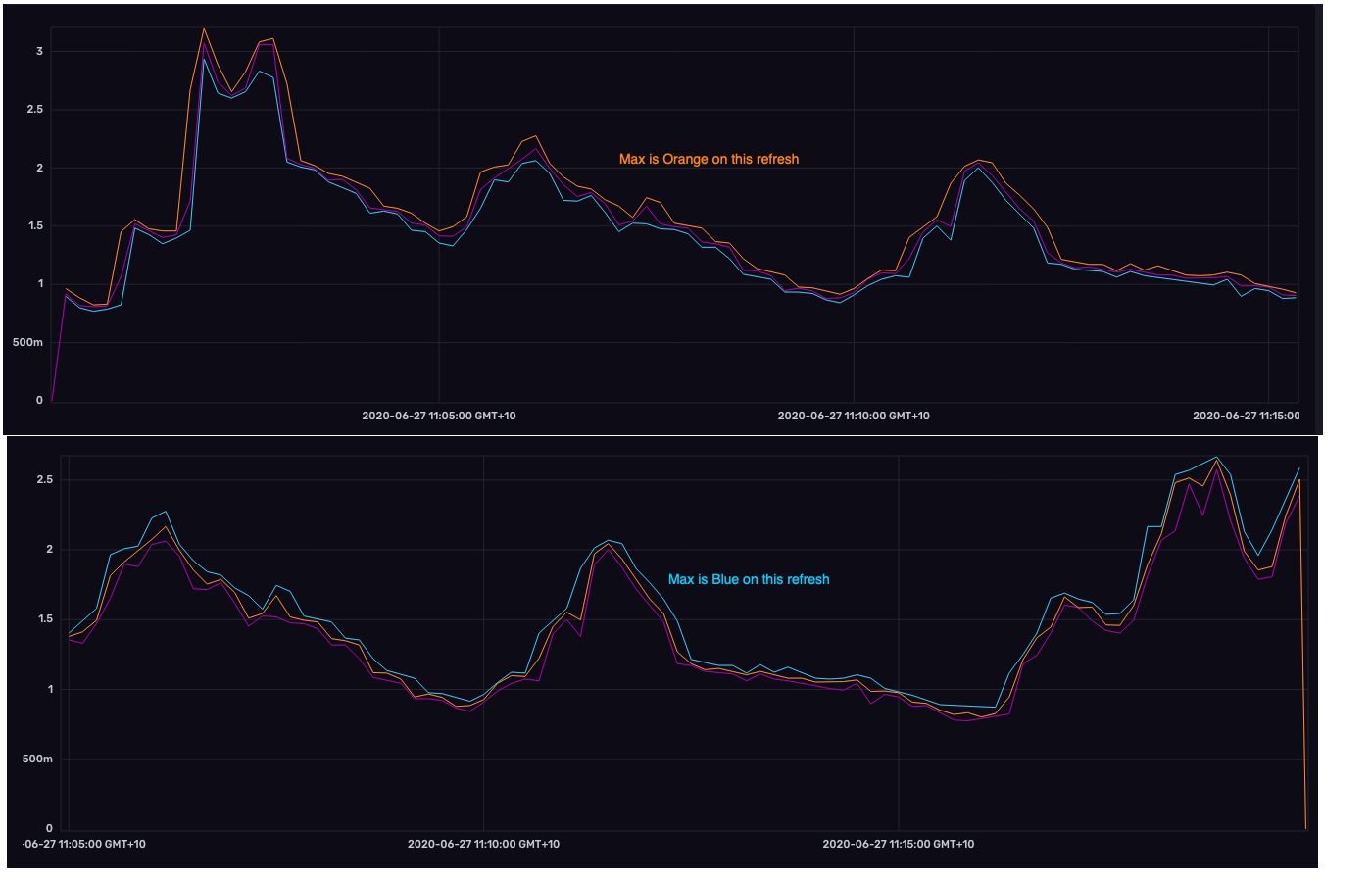
**Example2 - for a Min/Median/Max, the colours applied per statistic change on each refresh of the cell**
```
from(bucket: "test123")
|> range(start: v.timeRangeStart, stop: v.timeRangeStop)
|> filter(fn: (r) => r["host"] == "host1")
|> filter(fn: (r) => r["_measurement"] == "conntrack_value")
|> filter(fn: (r) => r["_field"] == "value")
|> filter(fn: (r) => r["type"] == "percent")
|> aggregateWindow(every: v.windowPeriod, fn: max)
|> yield(name: "max")
from(bucket: "test123")
|> range(start: v.timeRangeStart, stop: v.timeRangeStop)
|> filter(fn: (r) => r["host"] == "host1")
|> filter(fn: (r) => r["_measurement"] == "conntrack_value")
|> filter(fn: (r) => r["_field"] == "value")
|> filter(fn: (r) => r["type"] == "percent")
|> aggregateWindow(every: v.windowPeriod, fn: min)
|> yield(name: "min")
from(bucket: "test123")
|> range(start: v.timeRangeStart, stop: v.timeRangeStop)
|> filter(fn: (r) => r["host"] == "host1")
|> filter(fn: (r) => r["_measurement"] == "conntrack_value")
|> filter(fn: (r) => r["_field"] == "value")
|> filter(fn: (r) => r["type"] == "percent")
|> aggregateWindow(every: v.windowPeriod, fn: median)
|> yield(name: "median")
```
Contributor guide
Research direction
Start by reproducing the color changes with the two-host and min/median/max query examples in the issue, then trace the series-color assignment entry point used by Chronograf. Done means a host or statistic keeps the same controllable color across cells and refreshes.
Written by the indexing model from the issue text.
Assessment
- Domain
- data-visualization
- Issue type
- Bug
- Difficulty
- 4/5
- Estimated time
- 3-5 days
- Activity status
- Stale
- Clarity
- Mostly clear
- Newbie friendliness
- 35/100