influxdata / influxdata/influxdb
Scrollable Tooltip display for modest -> large # of fields for records
- Dominant language
- Rust
- Stars
- 31.7k
- Forks
- 3.7k
- Avg merge
- 13h 37m
- Merged PRs (30d)
- 8
Description
__Proposal:__
I'd like the ability to see all my data in the tooltip when hovering over the dashboard data.
__Current behavior:__
Much of my data is off the screen and unreadable no matter where I put my mouse in the UI. The screen isn't big enough to show the fields in the points.
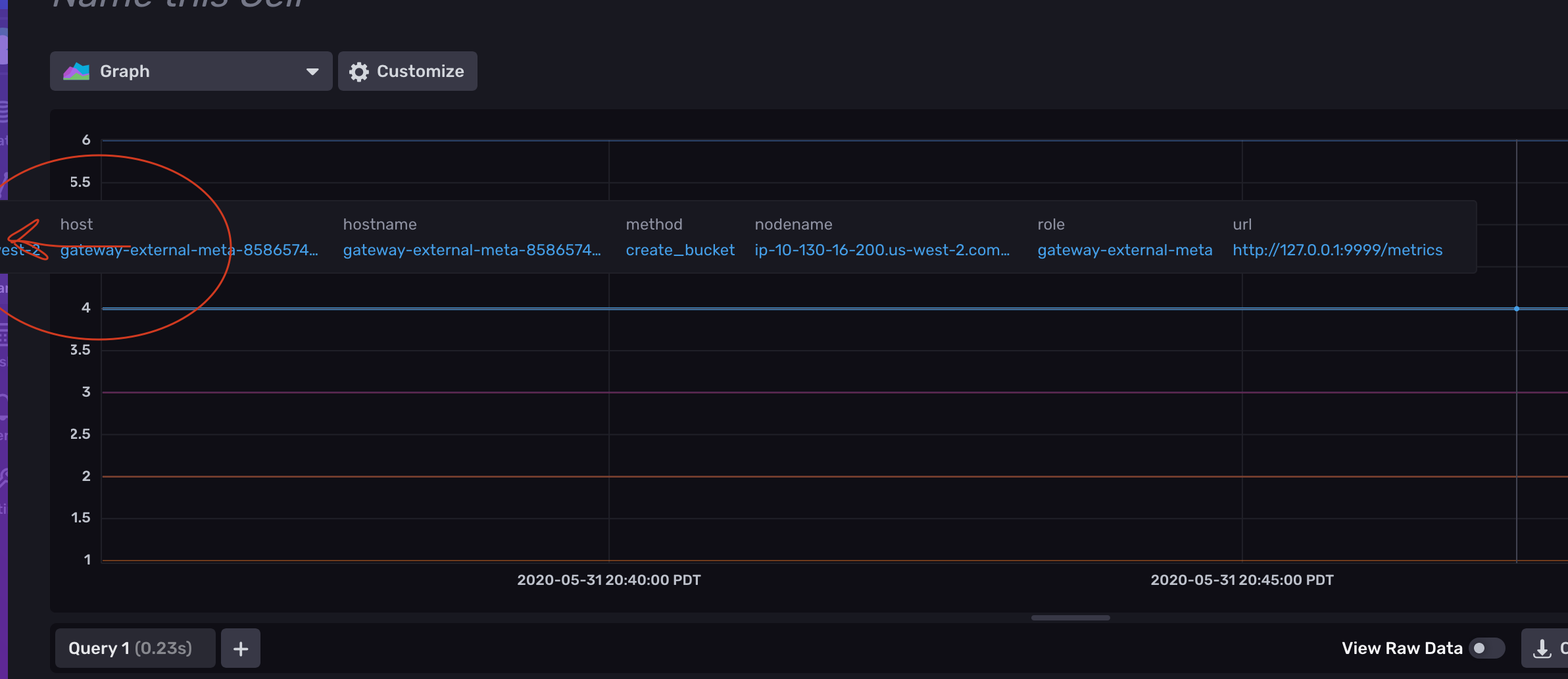
__Desired behavior:__
I'd like something I can read, preferably something scrollable perhaps.
__Alternatives considered:__
Not sure, open to anything that makes the data easy to read/consume and the experience is comfortable on my laptop.
__Use case:__
Reading the data the dashboards. Typically, I have to switch to table view, which is very hard to identify the time at which stuff happens. Either that or force myself to go into the flux editor and drop columns. Neither of these experiences feels very good when you want to use the dashboard as a traffic light indicator.
Contributor guide
Research direction
Start by locating the dashboard hover-tooltip implementation and reviewing how it lays out fields when the available screen space is limited. Compare the tooltip behavior with the dashboard and table views described in the issue. Done means dashboard data remains readable for records with many fields, including on a laptop-sized screen, with a comfortable way to access all fields.
Written by the indexing model from the issue text.
Assessment
- Tech stack
- react
- Domain
- data-visualization, frontend
- Issue type
- Feature
- Difficulty
- 5/5
- Estimated time
- Over a week
- Activity status
- Stale
- Clarity
- Needs clarification
- Newbie friendliness
- 25/100