influxdata / influxdata/giraffe
Visualization: Honeycomb (feature request)
Nobody has claimed this yet.
- Dominant language
- TypeScript
- Stars
- 189
- Forks
- 33
- Avg merge
- 3d 15h
- Merged PRs (30d)
- 4
Description
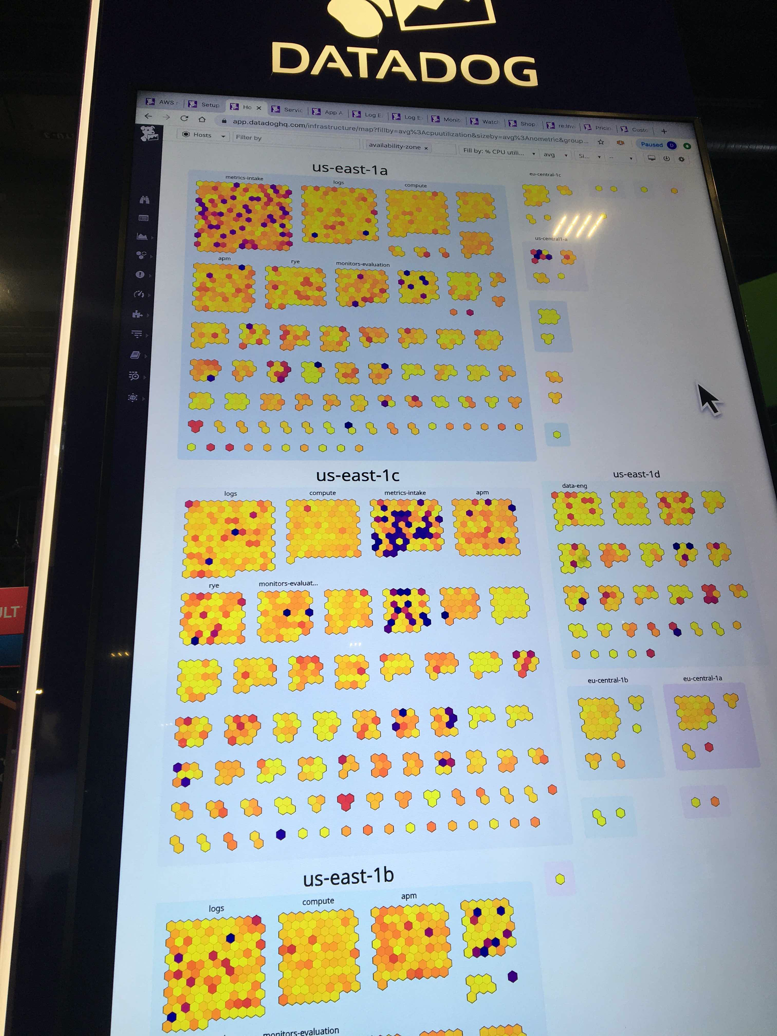
DataDog, in their demos, makes extensive use of a "honeycomb" visualization, where each cell represents a metric in one server or container (e.g., availability, CPU load, or perhaps a rollup of multiple metrics).
These honeycombs can be visually grouped by some tag such as AWS region. You can see an example below:
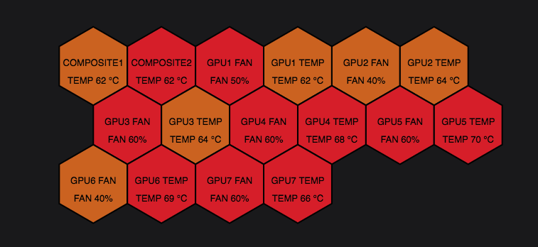
Grafana has a similar visualization, called a polystat (https://grafana.com/grafana/plugins/grafana-polystat-panel):
It'd be great if we could have a honeycomb visualization based on:
1) Drive color from some column specified by the user.
2) Color mappings should work for both numeric values and strings/regexes.
3) Optionally display text in each cell, with optional prefix and/or suffix. This text could be the same as the column that sets the color, or from some other column.
4) Optionally group honeycombs by some tag value.
Contributor guide
First steps
- Read the whole issue, then the project's contributing guide.
- Comment on the issue to say you are picking it up — it saves two people doing the same work.
- Fork the repository and make your change on a branch.
- Open a pull request that references the issue number.
Research direction
The issue describes a new honeycomb visualization but names no files, tests, or entry points. Start by locating the existing visualization architecture and comparable panel implementations, then clarify the interaction and grouping requirements before defining completion criteria for color mappings, cell text, and tag-based grouping.
Written by the indexing model from the issue text.
Assessment
- Tech stack
- typescript
- Domain
- data-visualization
- Issue type
- Feature
- Difficulty
- 5/5
- Estimated time
- Over a week
- Activity status
- Stale
- Clarity
- Mostly clear
- Newbie friendliness
- 30/100