influxdata / influxdata/giraffe
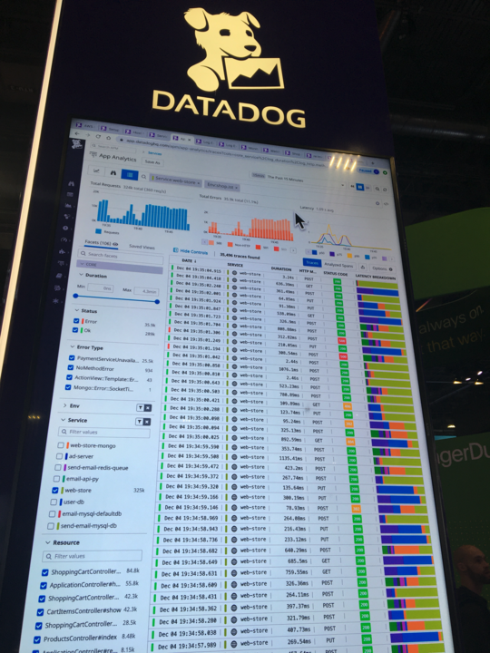
Visualization: table with bar chart column (feature request)
Open
kind/feature request
team/ui
- Dominant language
- TypeScript
- Stars
- 189
- Forks
- 33
- Avg merge
- 3d 15h
- Merged PRs (30d)
- 4
Description
DataDog has a visualization (example below) with a horizontal bar chart in one of the columns. This chart has color thresholds. It'd be great if we had a similar visualization.
Contributor guide
Research direction
Start by reviewing the existing visualization components in the Giraffe repository and compare their table capabilities with the linked DataDog example. Define the bar-chart column behavior, color-threshold rules, and completion criteria before locating implementation and test entry points; the issue names no files or tests.
Written by the indexing model from the issue text.
Assessment
- Tech stack
- typescript
- Domain
- data-visualization
- Issue type
- Feature
- Difficulty
- 5/5
- Estimated time
- Over a week
- Activity status
- Stale
- Clarity
- Needs clarification
- Newbie friendliness
- 25/100