influxdata / influxdata/giraffe
Add 'correlation heatmap' graphtype
- Dominant language
- TypeScript
- Stars
- 189
- Forks
- 33
- Avg merge
- 3d 15h
- Merged PRs (30d)
- 4
Description
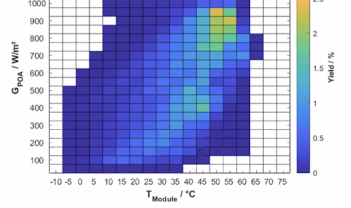
Even though we are a timeseries platform, sometimes it is helpful to graph two different time series metrics against one another to visualize the relationship between them.
A correlation heatmap would graph two metrics against one another, and therefore would not have a time axis. I believe our heatmap visualization is currently capable of performing this visualization except that a lot of our visualizations assume that the graph has a time axis.
Contributor guide
Research direction
Start by locating the existing heatmap visualization and the code paths that assume every graph has a time axis. Determine how two metrics should be supplied and rendered without that axis; done means a correlation heatmap can visualize their relationship while existing time-series visualizations continue to work.
Written by the indexing model from the issue text.
Assessment
- Tech stack
- typescript
- Domain
- data-visualization
- Issue type
- Feature
- Difficulty
- 5/5
- Estimated time
- Over a week
- Activity status
- Stale
- Clarity
- Needs clarification
- Newbie friendliness
- 35/100