Improve Step 2: duration/timezone box and title
- Dominant language
- JavaScript
- Stars
- 118
- Forks
- 76
- PR merge metrics
- No merged PRs in 30d
Description
This doesn't look great right now:
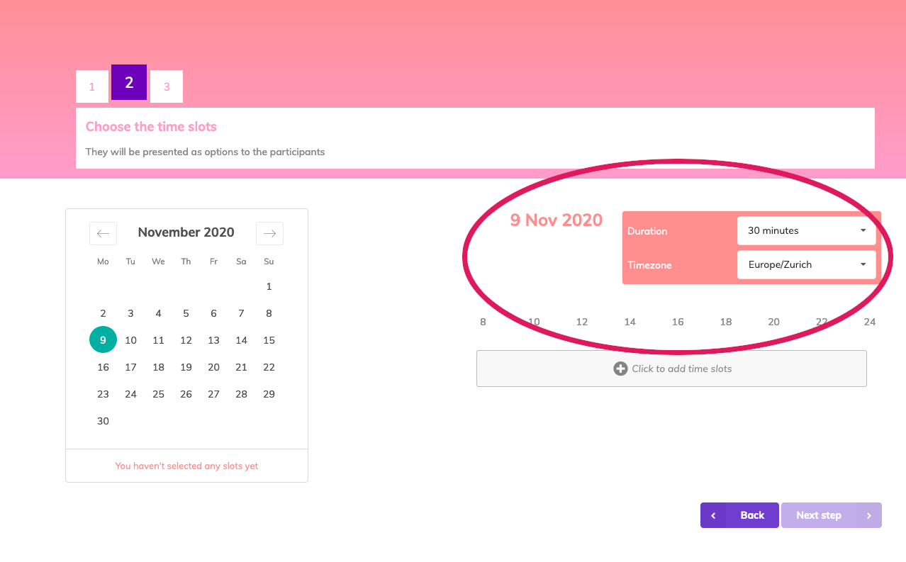
The alignment is weird and the box looks too prominent and out of place. Some ideas:
* Making the box smaller and/or the labels more compact;
* Making a sort of vertical grid layout, with the box in the middle and the day on top;
* *other ideas welcome*.
Contributor guide
No contributing guide indexed for this repository
Research direction
Start by locating the Step 2 duration/timezone box and title in the frontend, then compare its current layout with the linked screenshot. Explore a revised layout that addresses the alignment and visual prominence concerns; done means the Step 2 presentation is visibly more compact and balanced.
Written by the indexing model from the issue text.
Assessment
- Tech stack
- javascript
- Domain
- design, frontend
- Issue type
- Feature
- Difficulty
- 5/5
- Estimated time
- Over a week
- Activity status
- Stale
- Clarity
- Needs clarification
- Newbie friendliness
- 25/100