Improve navigation, layout and information density on the admin pages
- Dominant language
- Python
- Stars
- 53
- Forks
- 16
- Avg merge
- 14d 5h
- Merged PRs (30d)
- 14
Description
From a PR around including tabs as a new (revolutionary) concept in the admin pages:
---
Some random thoughts. We've not really paid attention to this layout, and I think if we are opening the "make it nicer box", there are some other things we might try to do on the way.
## The theme is wasting a lot of vertical space
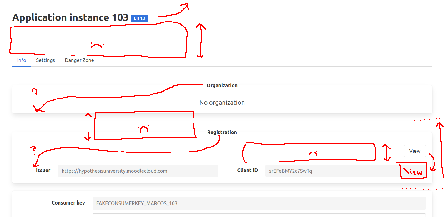
It's partly the theme, but it's also how we are using it. Some ideas for trying to get the "fold" where we start seeing info about the application instance higher up the page (although it applies to others too)
* Can we move the title into the menu bar? Or a sub-menu bar (would be a good place for high level buttons like "New organization")
* Can we cut down the white space below the title? (**Note**: I think this is due to there be a separate section for the title, which doesn't seem right semantically. If you merge them this goes away).
* Can we move the org and registration into a more tablular structure?
* Ideas include, moving the relationship type to the left and the view button to the right instead of vertical
* If there is no org / registration, maybe we can remove the box entirely, or have a smaller placeholder
## Some suggestions for locations / names
### Application Instance
* "Notes" and "Created" are in the "Tool Consumer" box but they aren't related to the Tool Consumer
* I'm assuming the save buttons will be fixed later
* Info / settings is a strange divide. You can change things in info, so it's not read-only (which this might imply). What about "Settings / Content Integrations"?
* VitalSource / JSTOR looks like it could do with it's own box?
* One day it would be amazing to only show you the relevant types for your install
* We could also only show you the rest of the settings if you tick "enabled" (this is more Javascript than we probably want right now)
* Maybe try two columns on the content integration page? Might mean you can see them all at once?
### Organization
* I really like having the Danger Zone in it's own tab, might be worth it just for that
* If not, probably put the Danger Zone as the last item in the page?
### Application instances / LTI Registrations / Organizations search pages
* Most menu systems let you highlight an item
* Could we use this instead of repeating it as a title?
* This wouldn't apply if we used a sub-menu, to accomodate "New Registration" etc.
- [x] If you click through the three pages, the placements of the buttons are inconsistent
_Originally posted by @jon-betts in https://github.com/hypothesis/lms/issues/4715#issuecomment-1337351491_
Contributor guide
No contributing guide indexed for this repository
Assessment
This issue has not been assessed yet.