Rework emoji reactions UI
- Dominant language
- JavaScript
- Stars
- 8
- Forks
- 1
- Avg merge
- 1d 9h
- Merged PRs (30d)
- 7
Description
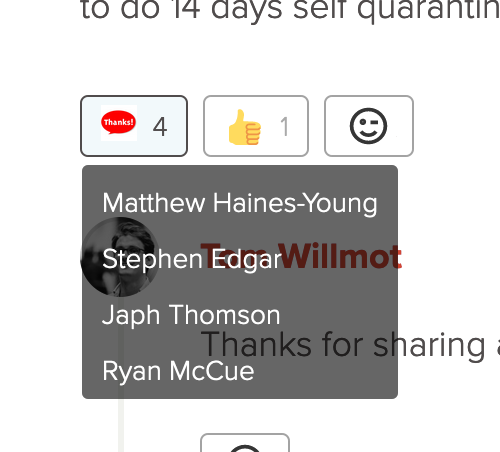
The emoji reactions UI hasn't changed since we first built it, so feels quite different to other UI elements. It also doesn't offer a huge amount of detail, which can make it tough to understand emoji replies, especially custom ones:
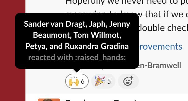
Compare this to Slack's emoji reactions, which are much clearer:
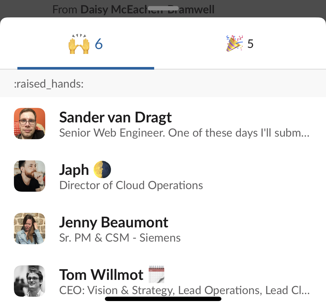
Additionally, the mobile UI and UX is not great, as it's essentially the same as the desktop. Compare Slack's UI where a long-press triggers an overlay window:
We should implement the following:
* [ ] Update reactions UI to be closer to other UI elements, such as hovercards (but reworked for the context, so without transitions)
* [ ] Show the name of the reaction in the UI
* [ ] Implement a long-press UI on mobile to view rather than just react
* [ ] Perform UX audit on mobile to check the flow and see if any further actions are needed
Contributor guide
Assessment
This issue has not been assessed yet.