UI: Improve UX for large lists of datacenters, admin partitions, and namespaces
- Dominant language
- Go
- Stars
- 30.1k
- Forks
- 4.6k
- Avg merge
- 1d 18h
- Merged PRs (30d)
- 39
Description
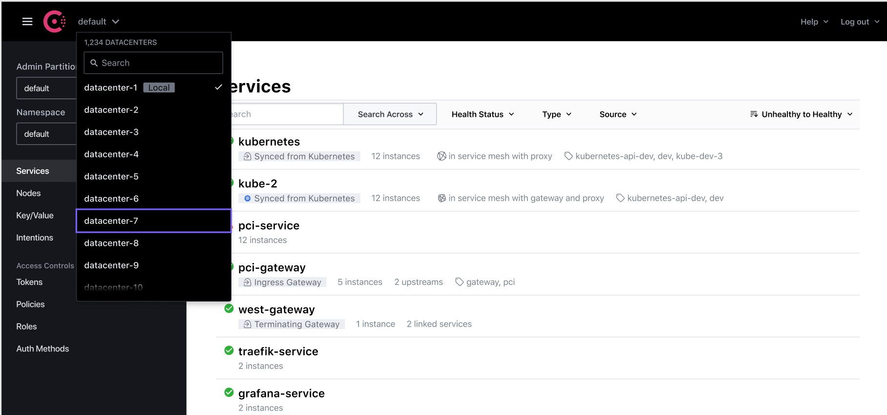
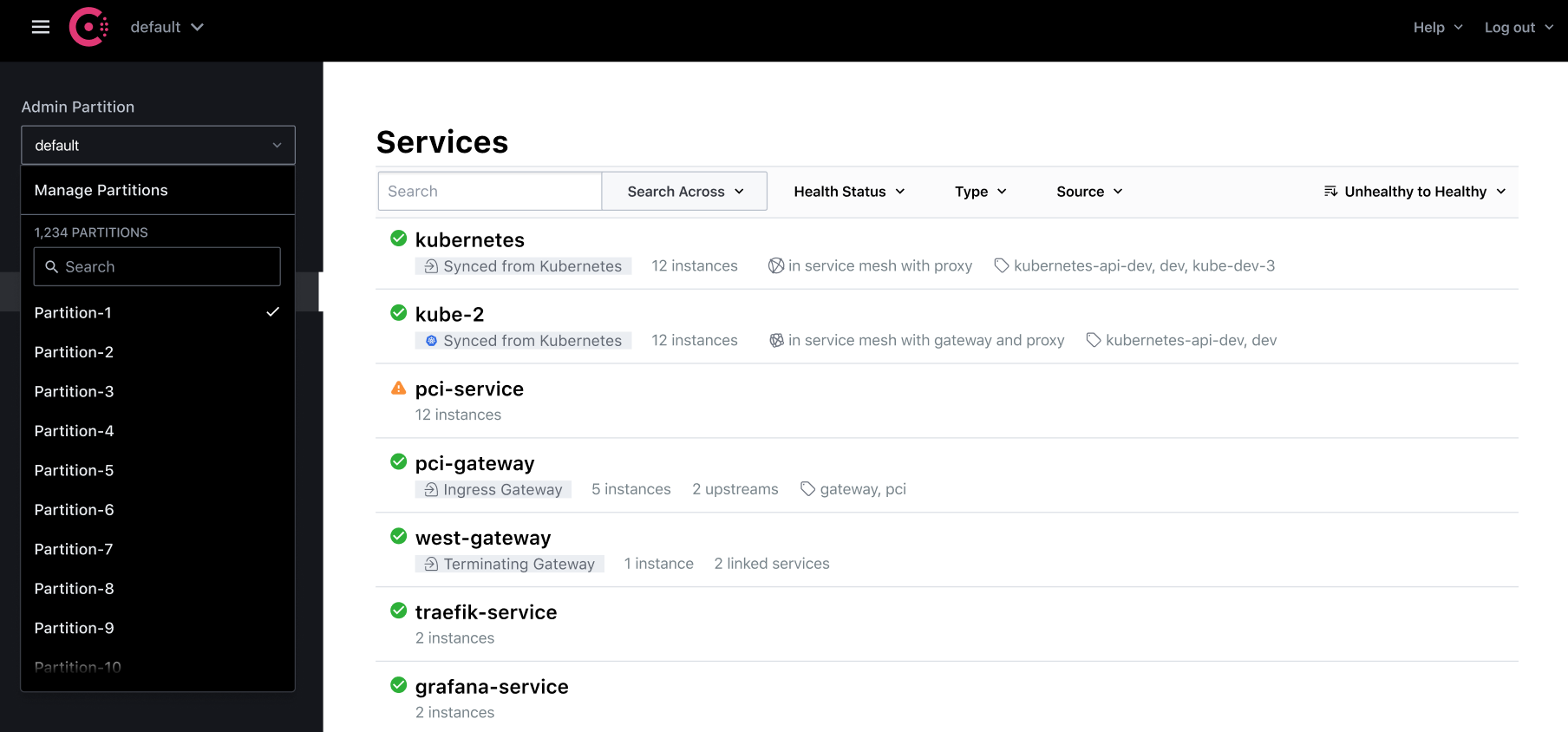
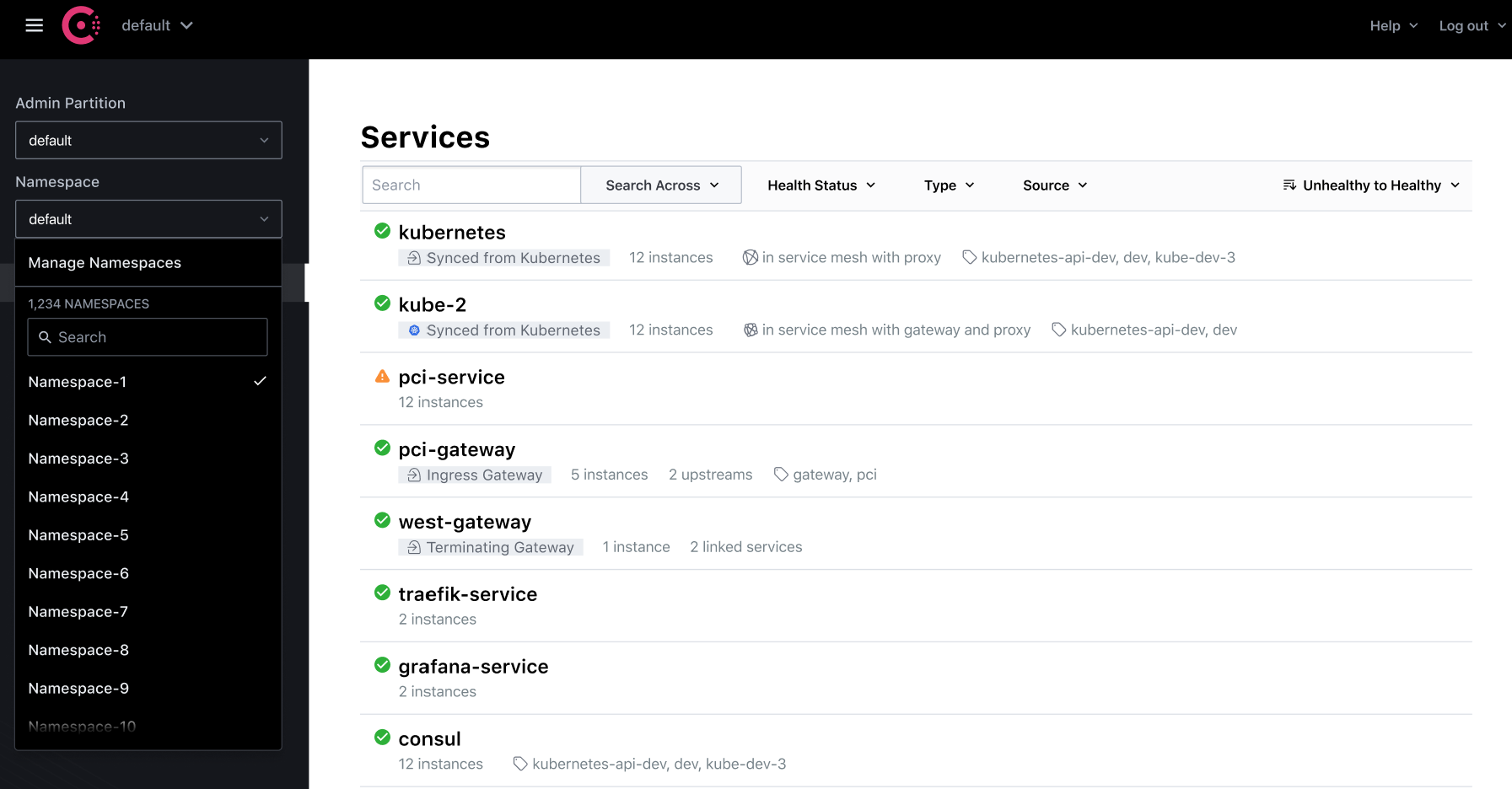
Users may have large numbers of datacenters, admin partitions, and/or namespaces. Currently, the Consul GUI presents lists of these entities in dropdowns that are designed to work best when the number of entities is <10 (one list with no search filter or scrollbar).
Related issues include:
- #11246 (namespace dropdown)
- #12867 (datacenter dropdown)
- #16193 (partition-related)
We should consider designs that provide a better UX for working with long lists of these entities, which may involve adding a search filter and scrollbar to the dropdown.
Possible design directions presented below are subject to change:
## Datacenters
## Partitions
## Namespaces
Contributor guide
Research direction
Start by reviewing the current Consul GUI dropdown behavior and the related issues #11246, #12867, and #16193. Compare the datacenter, partition, and namespace flows for large entity counts, then establish a design and implementation whose completed state makes those long lists usable.
Written by the indexing model from the issue text.
Assessment
- Domain
- design, frontend
- Issue type
- Feature
- Difficulty
- 5/5
- Estimated time
- Over a week
- Activity status
- Stale
- Clarity
- Needs clarification
- Newbie friendliness
- 25/100