guardian / guardian/dotcom-rendering
Lighthouse: Insufficient contrast on fronts cards
- Dominant language
- TypeScript
- Stars
- 274
- Forks
- 34
- Avg merge
- 2d 22h
- Merged PRs (30d)
- 121
Description
Our lighthouse reports for the DCR-rendered `uk` front are showing that some card text has insufficient contrast with the background:
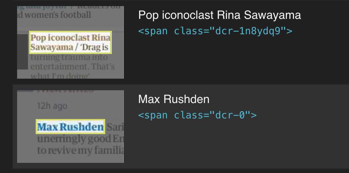
I believe that @HarryFischer said that [this figma file](https://www.figma.com/file/5CfbWOeZPRi15lXBD5u1rW/Card-layout-system) should be considered the source of truth for colour contrasts on cards.
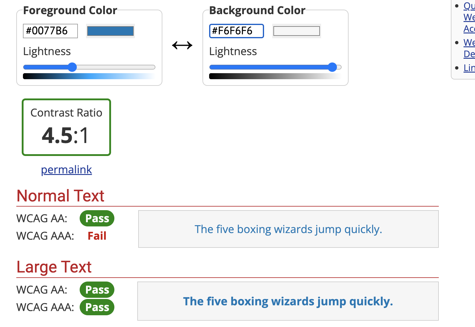
It looks like, at least for the sport card, we are using the intended colour (`sport.400`/`#0077B6`). The colour contrasts pass most tests (using https://webaim.org/resources/contrastchecker/) but not the AAA standard for small text. I'm assuming that this must be the standard that Lighthouse is applying. Given this, I think we need input from the design team about how to adjust the colour: should we use e.g. `sport.300`/`#005689`, which does pass?
Contributor guide
Assessment
This issue has not been assessed yet.