guardian / guardian/dotcom-rendering
DAC: Accordions -- keyboard accessibility and visual indicator of state
- Dominant language
- TypeScript
- Stars
- 274
- Forks
- 34
- Avg merge
- 2d 22h
- Merged PRs (30d)
- 121
Description
In the DAC call it was suggested that it would be helpful to add an indicator of the state of expandable components nearer to the controls, for users who might be highly zoomed-in when they click the header of a component [like this](https://www.theguardian.com/technology/2019/dec/17/best-smartphone-2019-iphone-oneplus-samsung-and-huawei-compared-and-ranked):
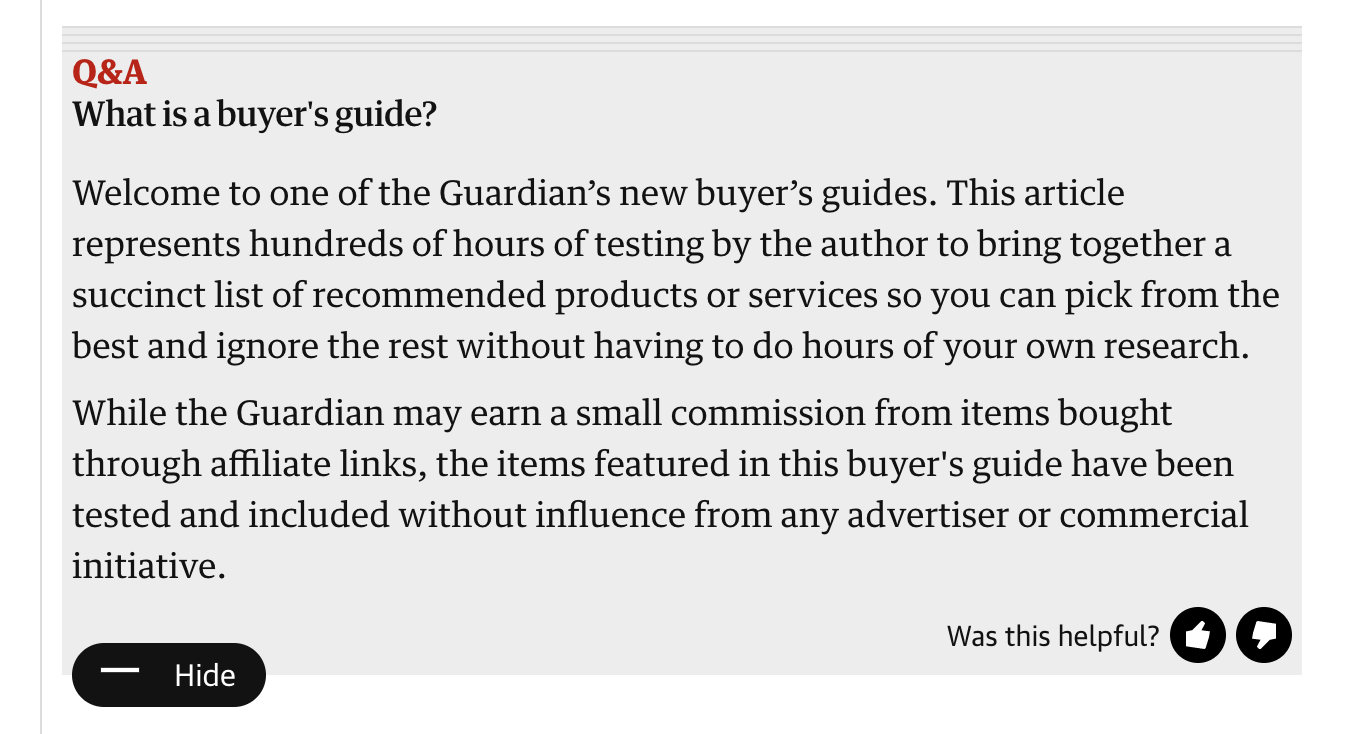
If you were very zoomed-in, you wouldn't be able to see the 'Hide' label, or the expanded content itself. It would be good for such users to get some feedback that their action has been successful.
It was also mentioned that the state of these components can be toggled either from the header, or from the button at the bottom. However, currently the header doesn't _look_ especially interactive either statically or on hover (wrong cursor-type). Whereas the 'show/hide' button looks obviously interactive, but can't be focused via the keyboard (or at least not in the expected way when tabbing through the page).
It was noted that the suggested fix would require some input from @HarryFischer as they would alter the design of the existing component.
Contributor guide
Assessment
This issue has not been assessed yet.