googlefonts / googlefonts/roboto-flex
Issue with the proportional uppercase/lining parameter
Open
- Dominant language
- HTML
- Stars
- 525
- Forks
- 35
- PR merge metrics
- No merged PRs in 30d
Description
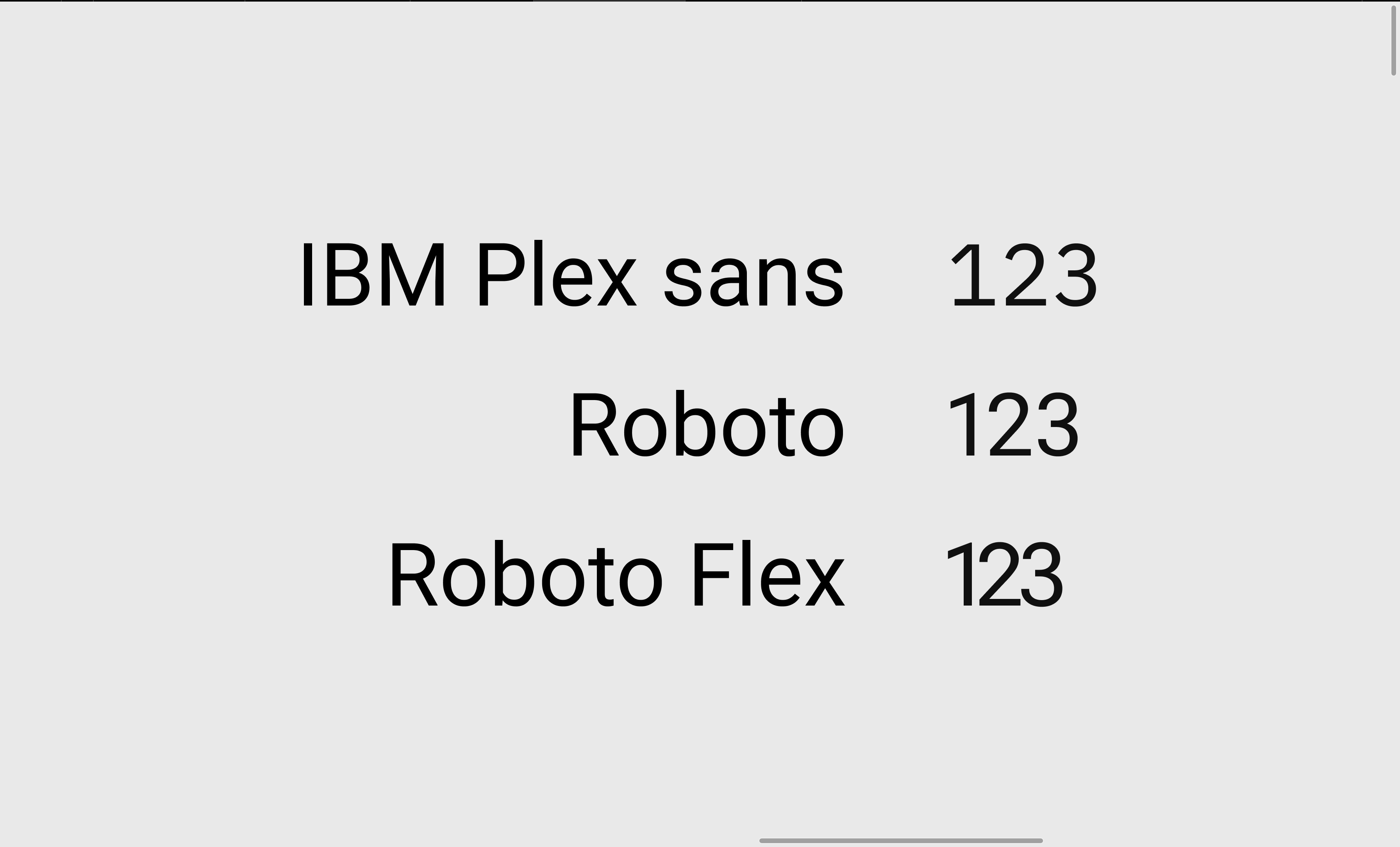
Hey Google. Roboto Flex is really looks better than the outdated Roboto but...when I try to use numbers with proportional uppercase/lining it looks like a condensed style. For example the Roboto and IBM Plex Sans do it good (see example). Please, fix that.
Contributor guide
No contributing guide indexed for this repository
Research direction
The issue names no source files, tests, or entry points; start by reproducing the proportional uppercase/lining-number example with Roboto Flex and compare it with the attached image and the cited Roboto and IBM Plex Sans behavior. Done means proportional uppercase/lining numbers no longer appear condensed.
Written by the indexing model from the issue text.
Assessment
- Domain
- design
- Issue type
- Bug
- Difficulty
- 4/5
- Estimated time
- 3-5 days
- Activity status
- Stale
- Clarity
- Needs clarification
- Newbie friendliness
- 25/100