googlefonts / googlefonts/roboto-flex
Cyrillic, diacritics and language support | wght: 100/400/1000 | wdth: 25/100/151 | slnt: 0 | opsz: 8
- Dominant language
- HTML
- Stars
- 525
- Forks
- 35
- PR merge metrics
- No merged PRs in 30d
Description
WDTH 100
**wght: 100** | wdth: 100 | slnt: 0 | GRAD: 0 | opsz: 8
ЇЇ - the distance between the dots isn't equal in UC in wght 100.

The distance is equal in LC which works better.

ћђғ - the bar left terminal angle is off
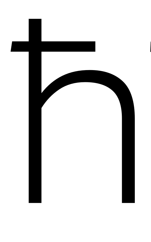
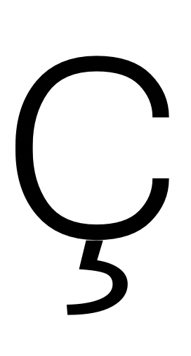
ҫ - cedilla is disconnected
_________________________________
**wght: 400** | wdth: 100 | slnt: 0 | GRAD: 0 | opsz: 8
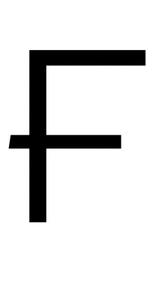
ћђғ - the bar left terminal angle is off
Ӿ Ғ- I wonder in thinner bar would be possible? In Ғ it seems heavier than top horizontal.
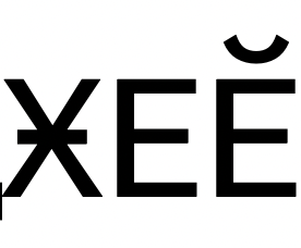

ӳ - diacritic seems to be pretty dense / dark. Also, can it move slightly to the left?
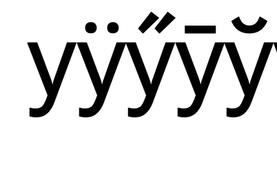
UC Ӳ - diacritic is a little dense / dark not as prominent in UC Ӳ.
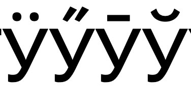
breve.cyr looks darker than breve.cyr.case. I think breve.cyr.case has better relation to overall color.
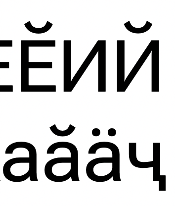
її - the dots in ї seems to be pretty dense / close. In wghts 100 and 900 they seem to be solved more nicely.

In UC the feeling of density is less prominent, but still slightly present.

______________________________________
**wght: 1000** | wdth: 100 | slnt: 0 | GRAD: 0 | opsz: 8
The bar in ғ is darker than in Ғ. The bar in Ғ is not long enough on the right. I think something in the middle would be a good weight fit.


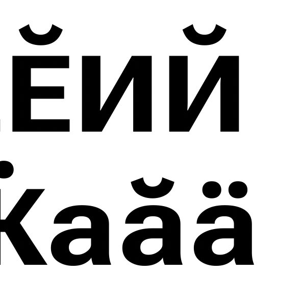
breve.cyr is darker than breve.cyr.case.
breve.cyr is maybe just a touch dark, but breve.cyr.case is too light. It also seems to miss some weight on 'verticals'.
Ҫ - diacritics is shifted to the left

Ӳ ӳ - diacritic seems too dark
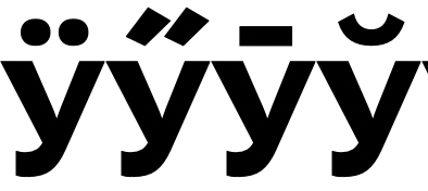
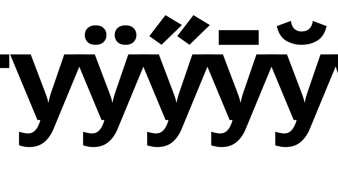
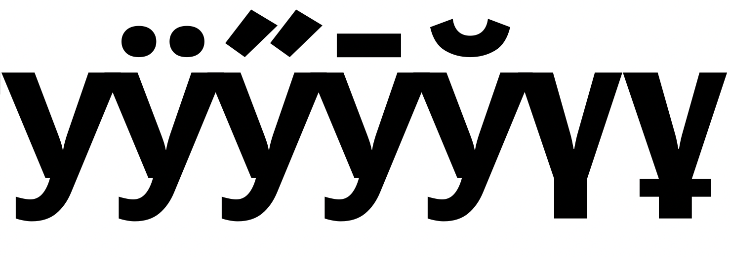
үұ seem to be too narrow.
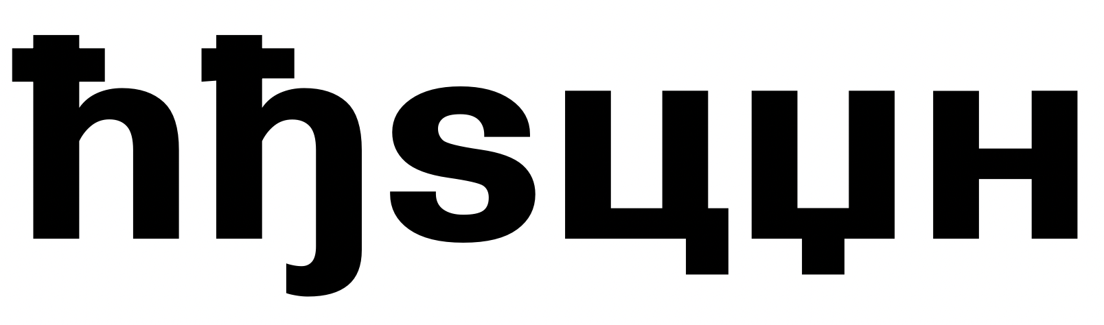
ћђ - compared to each other the bars have different weight and lenght on the left and on the right. Compared to the bar in -н both bars seems to be too dark.
I will add my observations about widths of opsz 8 in comments.
Contributor guide
No contributing guide indexed for this repository
Assessment
This issue has not been assessed yet.