googlefonts / googlefonts/roboto-flex
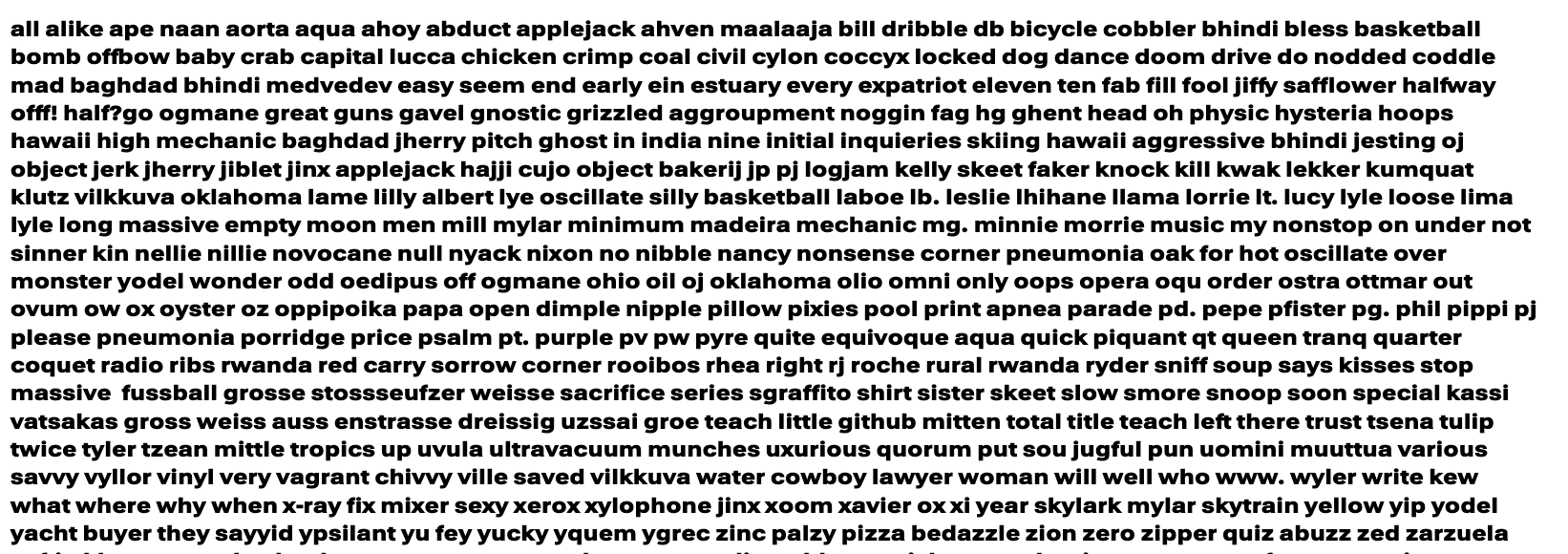
Over-emphasized lower case letters - 1000 wght | 14/8 opsz | wdth 100/25/151
Open
- Dominant language
- HTML
- Stars
- 525
- Forks
- 35
- PR merge metrics
- No merged PRs in 30d
Description
14 opsz | 100 wdth
See: s w k a z
More space between double f would be good.
The bite in the top of n for the join also seems too small
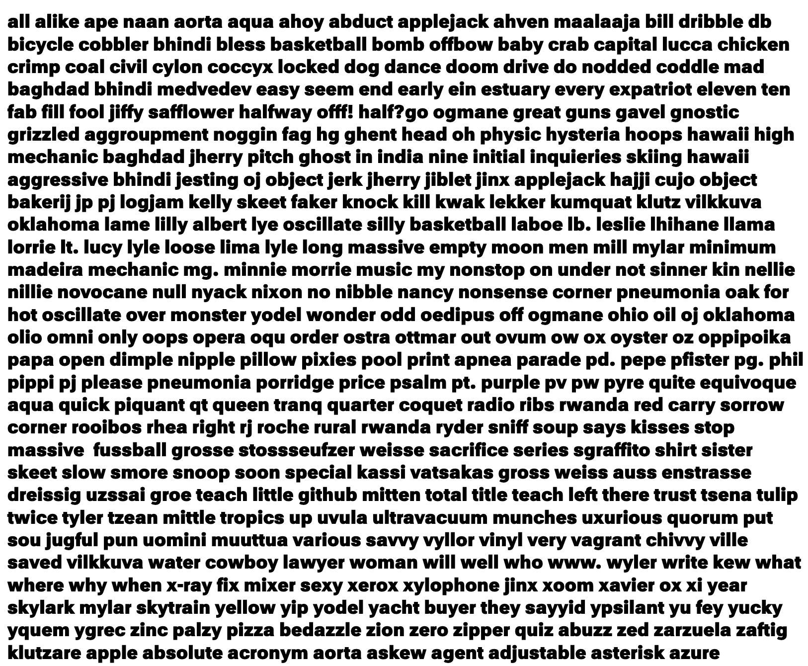
8 opsz | 100 wdth
See: s k w x double f - the s seems a bit too wide
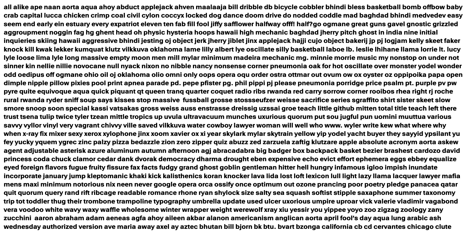
14 opsz | 25 wdth
See: u looks wide, k is too dark, s w double f
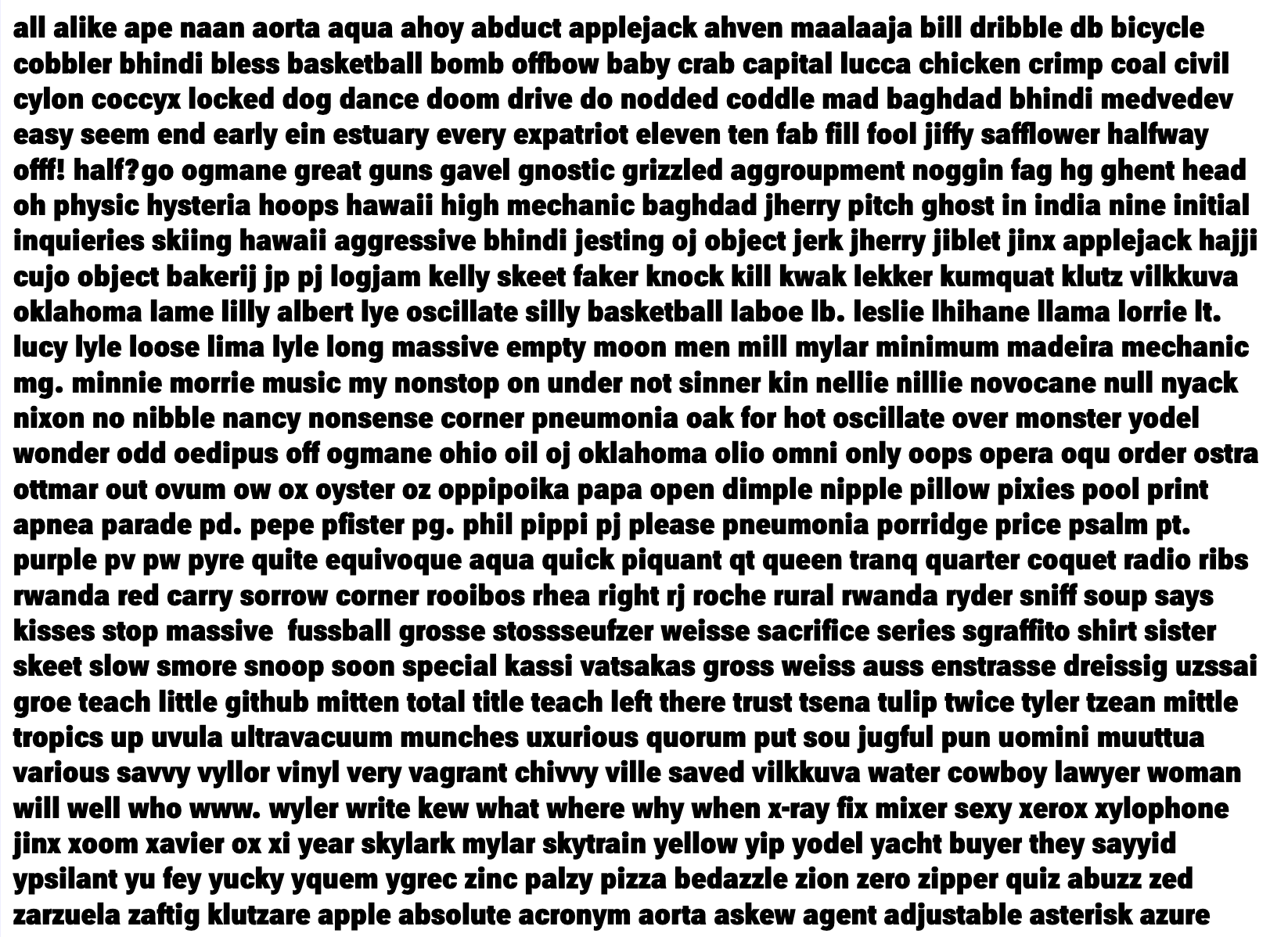
8 opsz | 25 wdth
See: k s
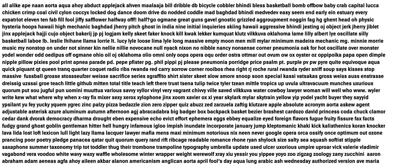
14 opsz | 151 wdth
See: k z s o w
k is not just dark also a bit wider than the other letters.
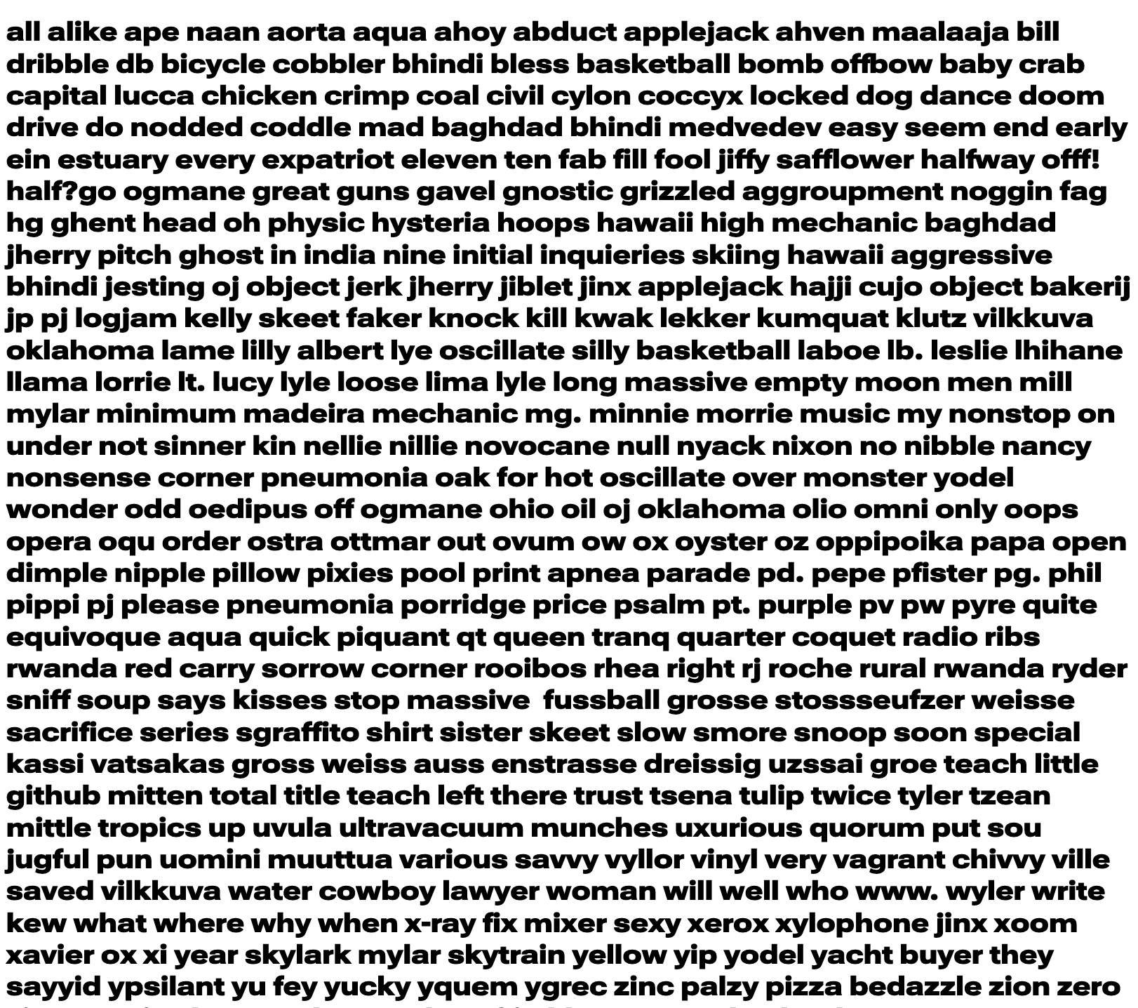
8 opsz | 151 wdth
See: g z k
Contributor guide
No contributing guide indexed for this repository
Assessment
This issue has not been assessed yet.