googlefonts / googlefonts/roboto-flex
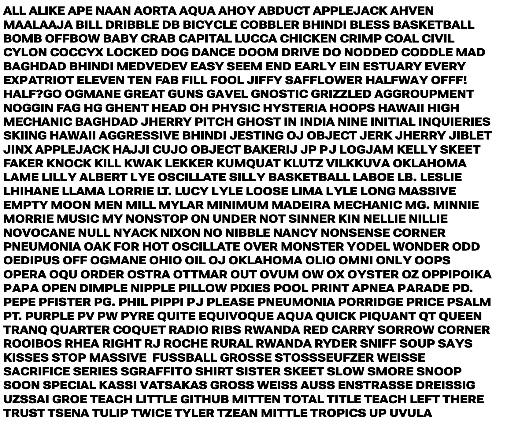
Over-emphasized Capital letters - 1000 wght | 14/8 opsz | wdth 100/25/151
Open
- Dominant language
- HTML
- Stars
- 525
- Forks
- 35
- PR merge metrics
- No merged PRs in 30d
Description
8 opsz | 100 wdth
The letters A S X N M all have parts that get too dark compared to the rest of the design, making them pop out and grab your attention. The idea of the contrast is I guess Ok but it seems too potent here.
Also V looks too wide.
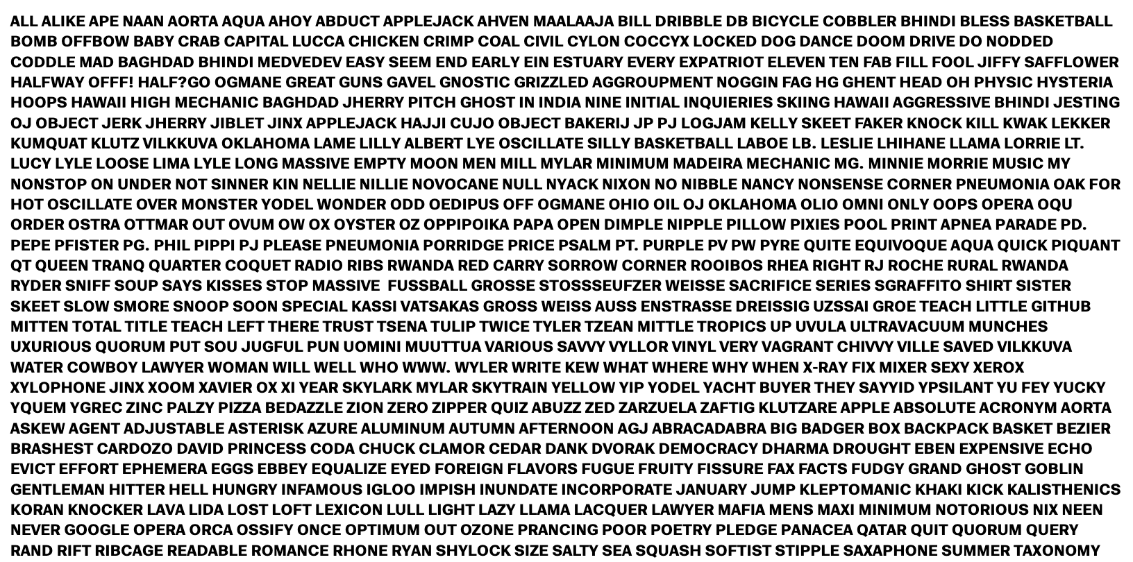
14 opsz | 100 wdth
See: A R S N M
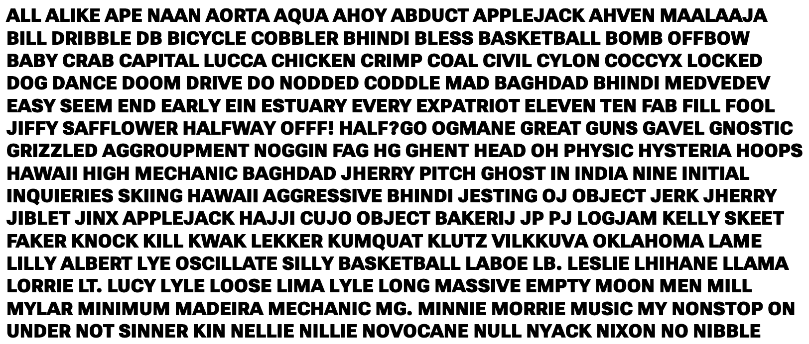
8 opsz | 25 wdth
the issues are fewer but some problems remain: see N M A K S
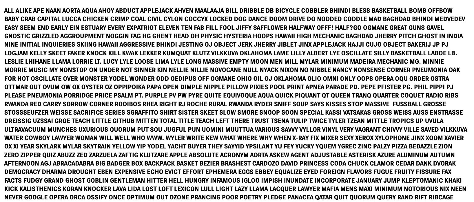
14 opsz | 25 wdth
See A K N M R and especially S.
Also G feels notably darker than C & O
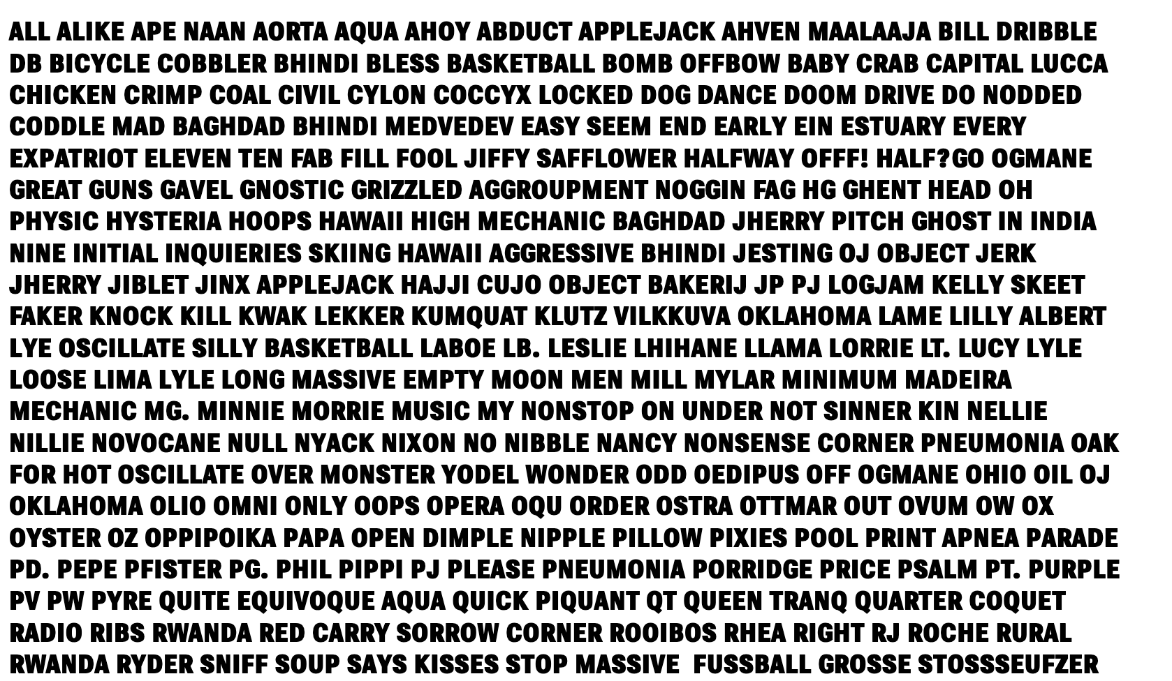
8 opsz | 151 wdth
See: M W S A N
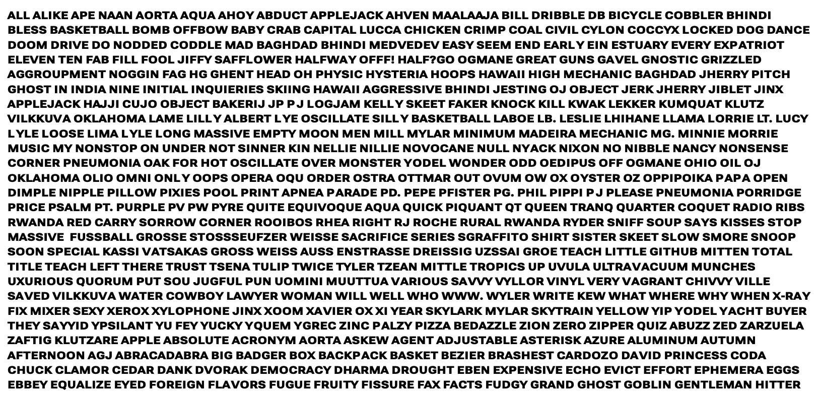
14 opsz | 151 wdth
See; S A K Z
Contributor guide
No contributing guide indexed for this repository
Assessment
This issue has not been assessed yet.