googlefonts / googlefonts/roboto-flex
Copyright and Registered - various VF axis
- Dominant language
- HTML
- Stars
- 525
- Forks
- 35
- PR merge metrics
- No merged PRs in 30d
Description
**In opsz 14**
@ wght 400 and wdth 100 Copyright and Registered have a very similar apparent weight and this is accomplished by letting the R in the circle in Registered use lighter strokes than are used in the C in Copyright. So far so good.


However when we move to 100 wght the strokes used for C hget lighter than R and the apparent weights start to differ


When we go to wght 1000 the opposite happens and the C gets too dark


**In 8 opsz**
the 100 wght is C is slightly too light


400 wght is fine
1000 the rings become distorted and a bit heavier than I'd prefer to see them


**144 opsz**
Separate from the questions raised below at 144 I think it is reasonable to let the Copyright and Registered signs diminish in relative size because as it is they are larger (or maybe better to say more visually prominent?) even than currency symbols and that just seems odd somehow.
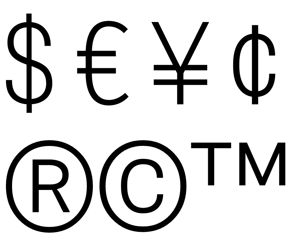
1000 wght 100 wdth looks strangely wide. Maybe the strokes don't need to be so heavy and the circle can stay more mono-weight looking. Also the angle of the leg of the R deviates from the angle used elsewhere

at 400 wght the problems mostly go away except that the R looks heavier than the C

At 100 wght it is fine.
Contributor guide
No contributing guide indexed for this repository
Assessment
This issue has not been assessed yet.