googlefonts / googlefonts/roboto-flex
& - various VF axis
- Dominant language
- HTML
- Stars
- 525
- Forks
- 35
- PR merge metrics
- No merged PRs in 30d
Description
Some of the design space has solutions for the ampersand that while they don't break what's going on in the middle don't look that lovely on their own. The ampersand is very hairy to sort out as it the sheer scale of the design space but the goodness of some of them makes me think they all might achieve more similarly if not equally.
1000 wght | wdth 25 | opsz 144
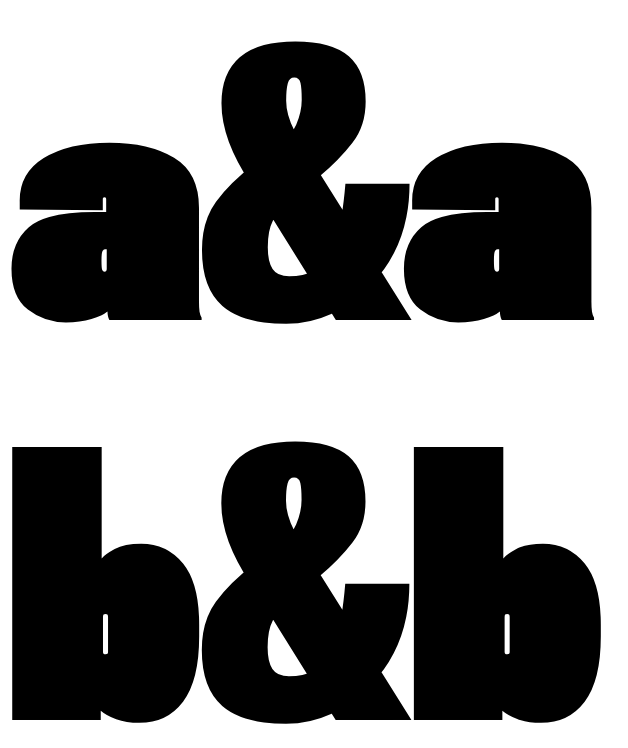
In contrast 100 wdth looks much better

wdth 151 - not as much but better than 25

Also because the reference proportion of the ampersand is on where the bottom is brighter bigger and wider and this generally maintained in the design

I would like to see the 8 opsz | 151 width| 1000 wdth keep it too. Either a smaller head or a larger lower part would do it. I'm guessing a larger bottom may be best.

At the intended size it also looks surprisingly dark
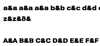
This is also true at 25 wdth
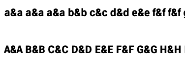
and 100 wdth too
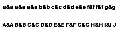
Although it is less obvious.
Contributor guide
No contributing guide indexed for this repository
Assessment
This issue has not been assessed yet.