googlefonts / googlefonts/roboto-flex
Latin - observed problems - Capitals and lower case -various opsz | various wght | 100 wdth | GRAD 0
- Dominant language
- HTML
- Stars
- 525
- Forks
- 35
- PR merge metrics
- No merged PRs in 30d
Description
U -
The width and relative proportion of H vs V is odd in Roboto with the U being narrower than expected vs H. In general this is well managed but in the 144 opsz and 400 weight, the difference becomes so great that it draws attention. I suggest that the difference be tempered and the U be made closer in width to H even if it doesn't match.

T -
The width of the T appears to be wider than I'd prefer it to be in a workhorse design across all opsz in 400 wght. even 2 units less wide on each side would do a lot.
This is 14 opsz
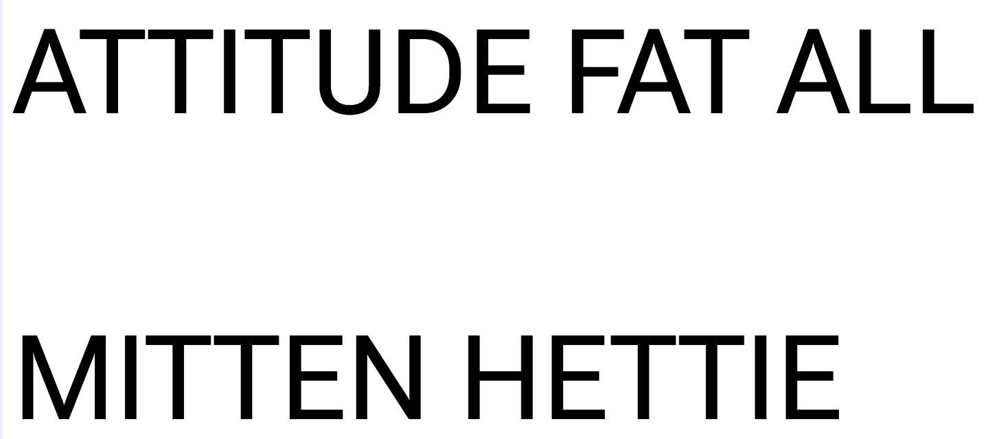

This is 8 opsz
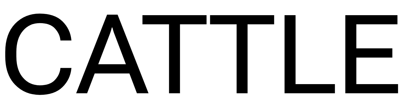

However at 144 opsz the gap is narrower still.
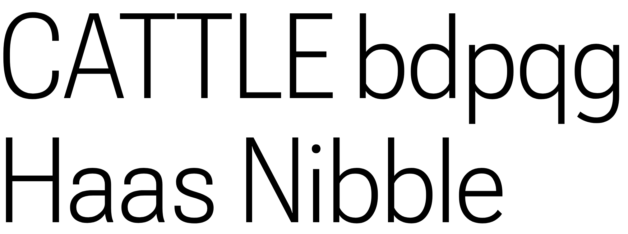
I think rather than pulling the stroke in the thing to do is just give it a bit of space on each side to be in keeping with the rest of the design.
F - The width of the F @ 144 opsz & 400 opsz is unexpectedly narrow

u - @ 8 opsz | 400 wght
The u looks too wide and brighter than n at this opsz
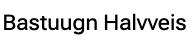
This is the same stuff made much bigger 144 and it makes some sense that it seem to be the same or slightly wider when seen large which I think doesn't work
u - 14 opsz


The same thing is going on here but it is less intense.
N - 8 opsz
The N is reading as a bit dark in the diagonal stroke
Here it is at the intended size

And much bigger you can see why
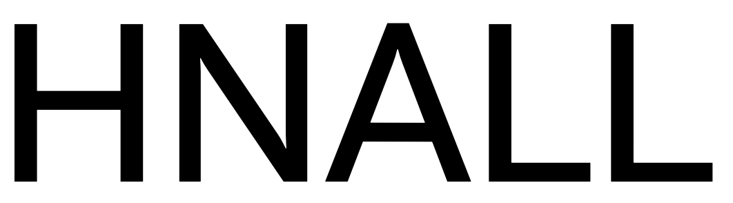
k & w - 8 opsz | 1000 wght
In the ruder test you can see the k and w popping out of the group because they look darker
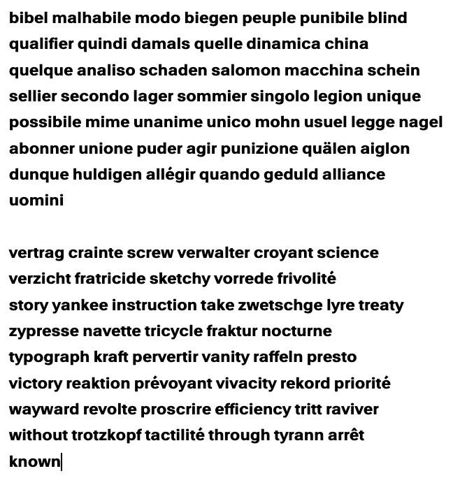
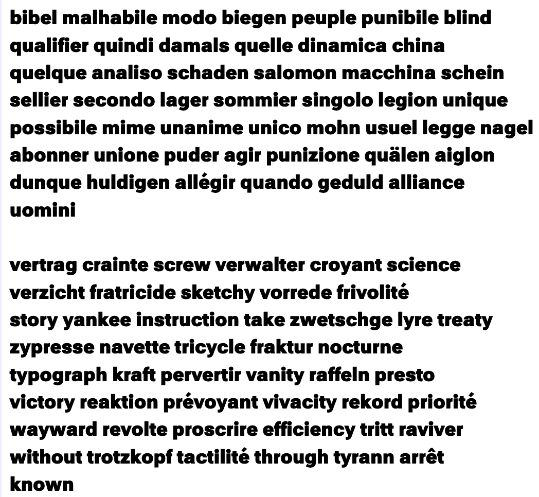
s, e, a, k, w , W V - 14 opsz | 1000 wght
These letters appear darker than the others. The V also looks too wide.
Contributor guide
No contributing guide indexed for this repository
Assessment
This issue has not been assessed yet.