googlefonts / googlefonts/roboto-flex
Cyrillic LC doesn't match Latin in proportions in wght: 400 | wdth: 25 | slnt: 0 | GRAD: 0 | opsz: 8
- Dominant language
- HTML
- Stars
- 525
- Forks
- 35
- PR merge metrics
- No merged PRs in 30d
Description
wght: 400 | wdth: 25 | slnt: 0 | GRAD: 0 | opsz: 8
Cyrillic LC letterforms widths don't match Latin.
Basic Cyrillic letters seem too wide.

Overall Cyrillic LC is too wide (with exception of letters which use components from Latin). But the widths are also inconsistent between Cyrillic letters.

бвлчцшщьыъ seem to be especially wide.
уф seem very narrow.
л is too wide even compared to п (which is already wide).
кж - the white triangle countershapes do not seem to be pointing to the horizontal bar but above it.

In UC Cyrillic proportions match Latin. I have a few observations.
Л - seems to be too wide.
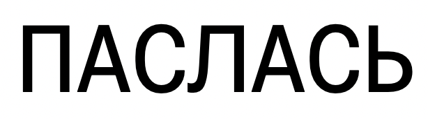
Й - breve.cyr is shifted
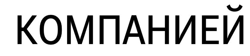
Ы - the distance between bowl and the right stem is too wide.
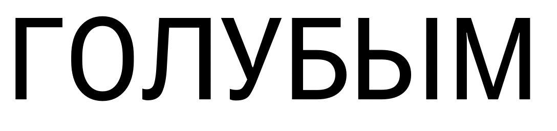
Ч - is it slightly too wide?

Contributor guide
No contributing guide indexed for this repository
Assessment
This issue has not been assessed yet.