googlefonts / googlefonts/roboto-flex
Zero 6 & 9 - 8 opsz | 1000 wght | 100 wdth
Open
- Dominant language
- HTML
- Stars
- 525
- Forks
- 35
- PR merge metrics
- No merged PRs in 30d
Description
(was 900) The zero and 6 and 9 seem to be too dark. It doesn't seem to be stroke width. Instead, I think it is probably because they are not condensed enough to fit into this fixed width. Note how 3 and 6 seem to touch.
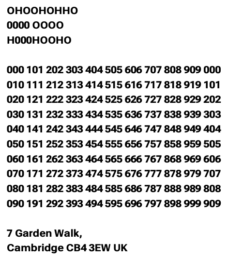
I'd like to see the default width made wider not to change the design of the numbers but just to give them air across all three wghts. This would also make the 1 seem less objectionable. As it is it really sticks out without a base stroke ( which I know we cannot have).



Contributor guide
No contributing guide indexed for this repository
Assessment
This issue has not been assessed yet.