googlefonts / googlefonts/roboto-flex
k w a f s - 8 opsz / 900 wght / 100 wdth
- Dominant language
- HTML
- Stars
- 525
- Forks
- 35
- PR merge metrics
- No merged PRs in 30d
Description
k, w - The k and w each are dark and as a result pop a bit harder then the rest of the letters and so don't fit as well as they could.
See the word vikkuva for k ( upper left quadrant )
See the word lawyer for w. And In the case of the lawyer notice the excellent color fit of y vs w.
a - The letter a has slightly more space around it than other letters do. This interrupts the rhythm a little. Look at the word massive for example and the way the a seems to yawn open around it.
f - The spacing of f is a little tight on the right side which makes a doubling of f look darker than the text color is generally. The shape is probably fine
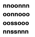
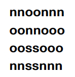
s- this letter is just very slightly dark
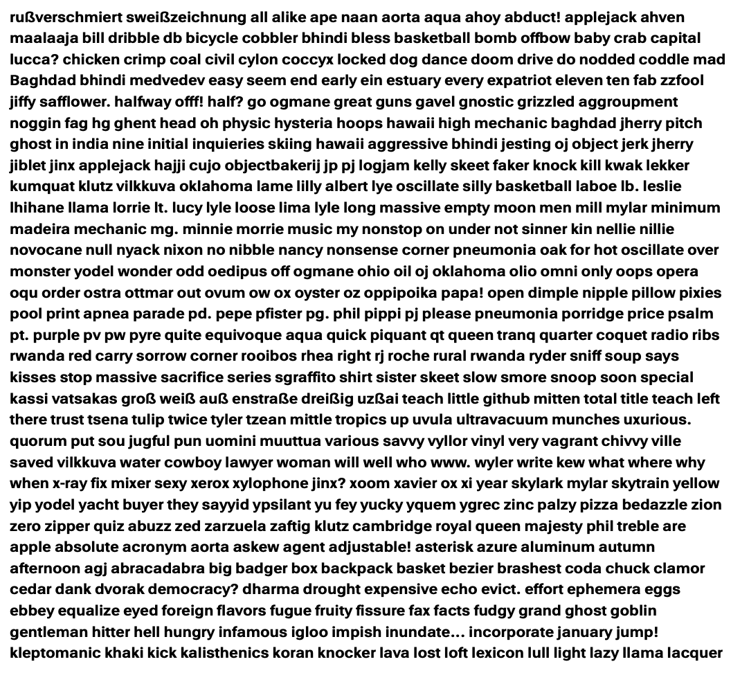
s- drawbot vs PDF rendering
Contributor guide
No contributing guide indexed for this repository
Research direction
Start by reviewing the issue’s attached DrawBot and PDF rendering comparisons for the k, w, a, f, and s glyphs at 8 opsz, 900 wght, and 100 wdth. Compare those examples with the referenced words, then confirm that the glyph darkness, spacing, and rendering differences have been resolved consistently.
Written by the indexing model from the issue text.
Assessment
- Domain
- design
- Issue type
- Bug
- Difficulty
- 5/5
- Estimated time
- Over a week
- Activity status
- Stale
- Clarity
- Mostly clear
- Newbie friendliness
- 25/100