googlefonts / googlefonts/roboto-flex
g & s lower case spacing eccentricities 144 opsz | 100 wdth
- Dominant language
- HTML
- Stars
- 525
- Forks
- 35
- PR merge metrics
- No merged PRs in 30d
Description
g - in the 400 wght seems not to be centered. It could maybe be even tighter on the right or remain as is but it too loose on the left vs n.
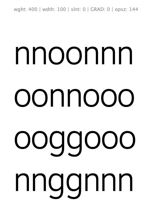
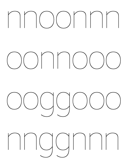
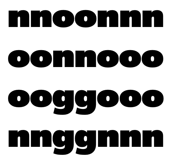
This problem exists in the light and black too but it is subtle
s - in the 400 weight the s seems to have somewhat excessive spacing compares to n and o
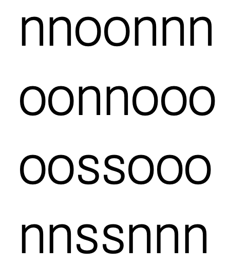
in 100 wght it doesn't but it seems slightly offset to the right
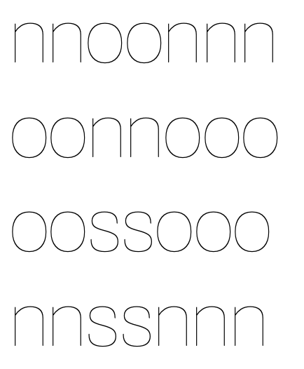
900 is OK
Contributor guide
No contributing guide indexed for this repository
Research direction
Start by examining the lowercase g and s in the 400 weight, then compare the light, black, 100, and 900 weight examples shown in the issue. Use the attached comparisons to evaluate centering and spacing against n and o; the work is done when the reported inconsistencies are resolved across the affected weights.
Written by the indexing model from the issue text.
Assessment
- Domain
- design
- Issue type
- Bug
- Difficulty
- 4/5
- Estimated time
- 3-5 days
- Activity status
- Stale
- Clarity
- Needs clarification
- Newbie friendliness
- 35/100