googlefonts / googlefonts/roboto-flex
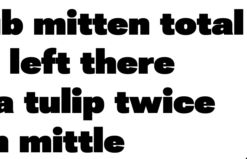
e - 144 opsz | 100 wdth | 900 wght
Open
- Dominant language
- HTML
- Stars
- 525
- Forks
- 35
- PR merge metrics
- No merged PRs in 30d
Description
The e shares stroke width with the other letters but optically it appears slightly heavier than the rest. I think a slightly bigger and brighter counter would fix this. I would let it be slightly taller and maybe a bit boxier. Lower case c is also wider looking an e and maybe e could be slightly wider too?
Contributor guide
No contributing guide indexed for this repository
Assessment
This issue has not been assessed yet.