googlefonts / googlefonts/roboto-flex
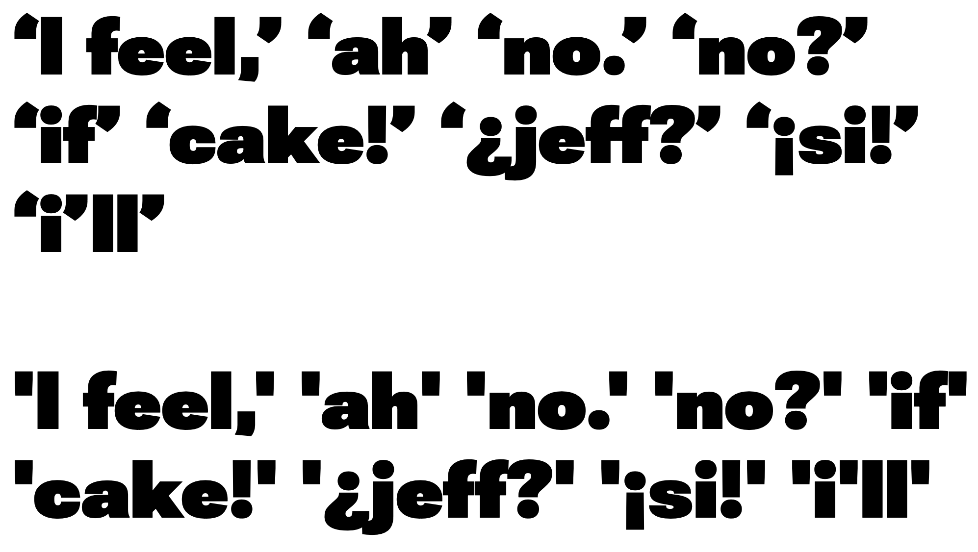
quotes - 144 opsz | 900 wght | 100 wdth
Open
- Dominant language
- HTML
- Stars
- 525
- Forks
- 35
- PR merge metrics
- No merged PRs in 30d
Description
In the 900 wght the curling quotes; instead of being good supporting actors, seems to want to steal the scene. The straight or dumb quotes have a more appropriate weight and presence. Even the straight quotes could probably be toned back a little with no loss of meaning or clarity.
The 400 and 100 wght don't have this issue
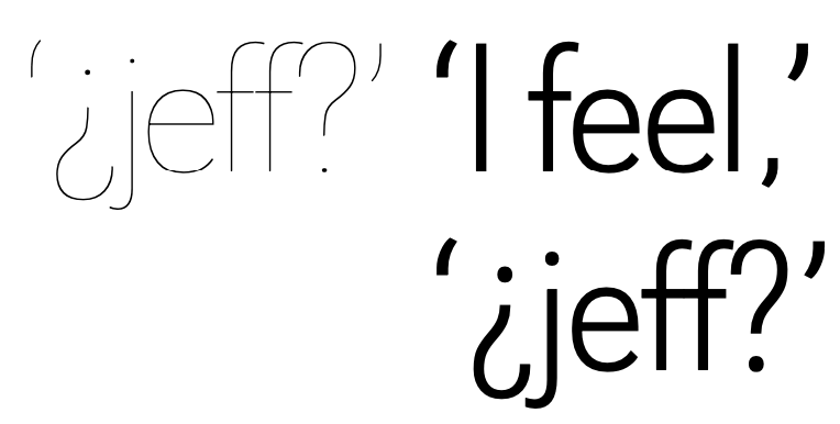
But in the 100/lightweight I think that the curling quotes would match the rest better with a more exaggerated curve that registers as a curve with the same force seen in the 400.
Contributor guide
No contributing guide indexed for this repository
Assessment
This issue has not been assessed yet.