googlefonts / googlefonts/roboto-flex
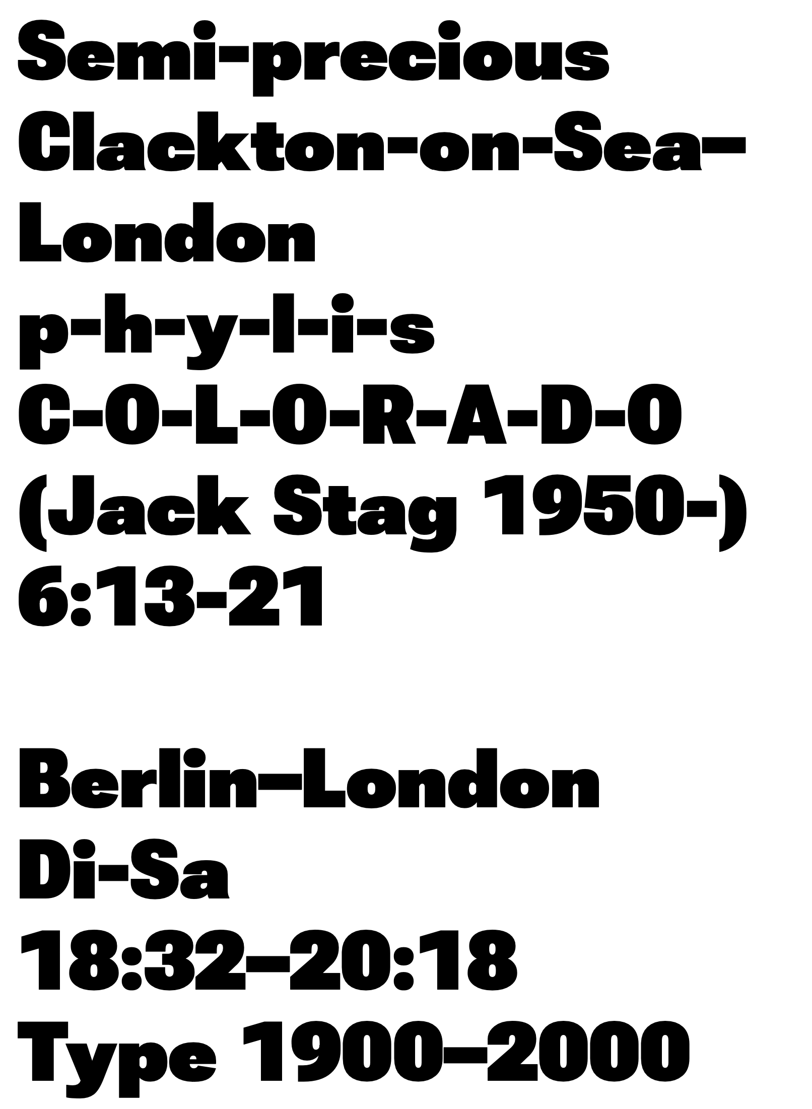
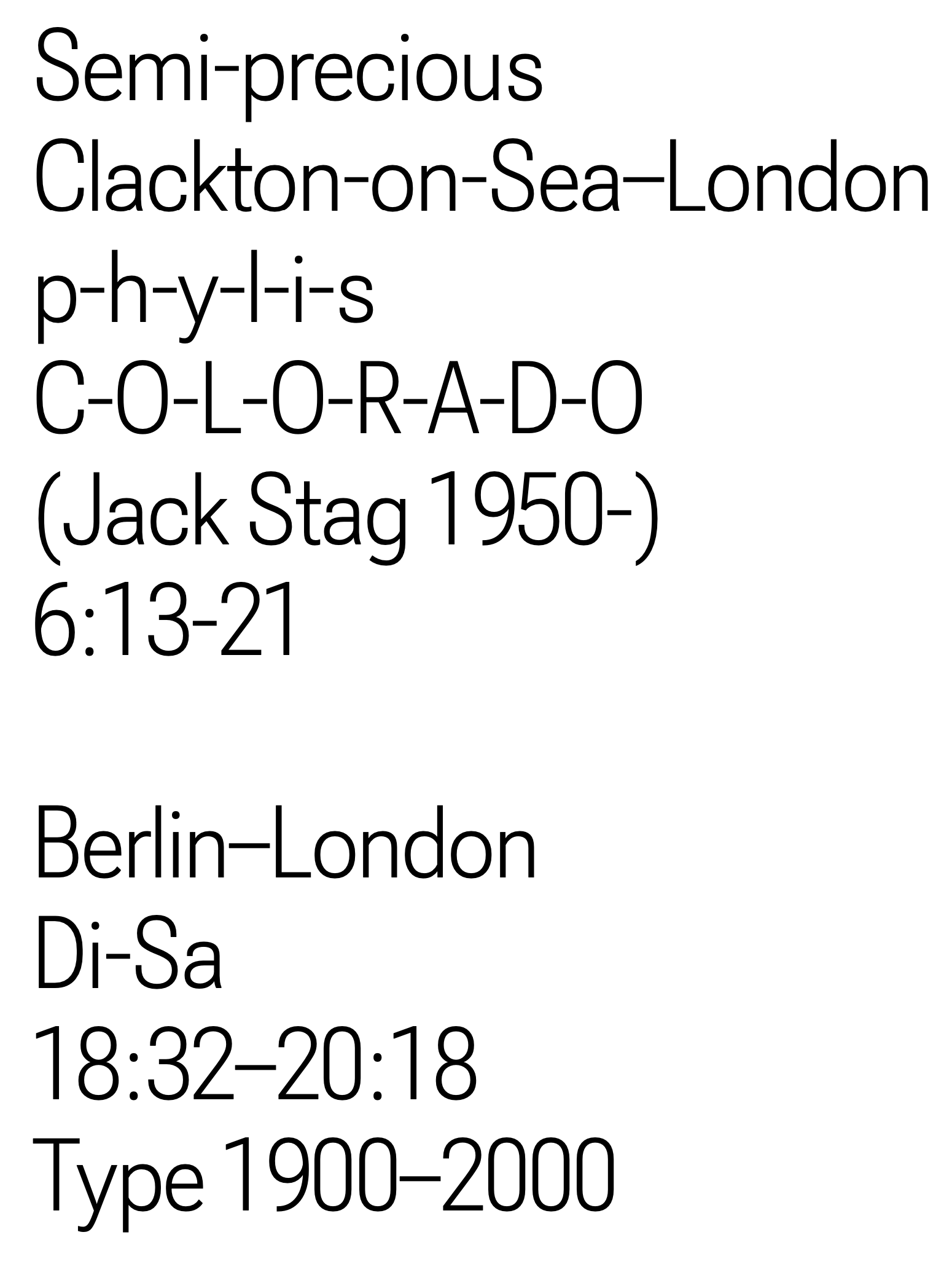
hyphens and en and em dashes - 144 opsz | 900 wght | 100 wdth
Open
- Dominant language
- HTML
- Stars
- 525
- Forks
- 35
- PR merge metrics
- No merged PRs in 30d
Description
The hyphens at the 900 weight look odd. This is because their optical center seems to rise up vis a vis the lower case when they grow evenly from their middle. Allowing this creates an unbalanced look.
In addition, the side bearings of the hyphen which seem to be fine in other weights seem to be exaggeratedly tight here. This is even more true of the endash, which is sometimes made to be tighter than the hyphen. But in this case, it is too close to other glyphs as a result. The em dash seems maybe too loose but more problematic is that it looks like the side bearings are uneven

Contributor guide
No contributing guide indexed for this repository
Assessment
This issue has not been assessed yet.