googlefonts / googlefonts/roboto-flex
? width 100 wght | 14 opsz
- Dominant language
- HTML
- Stars
- 525
- Forks
- 35
- PR merge metrics
- No merged PRs in 30d
Description
I think because the counter stays fairly constant the apparent width and the apparent presence and proportion of the ? in 100 wght gets fairly narrow.
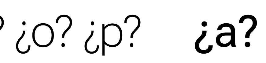

I think it would feel more expected and natural if the counter and the overall width of the top of ? in 100 wght was wider
Contributor guide
No contributing guide indexed for this repository
Research direction
Compare the question-mark glyph shown in the issue images at 100 wght and 14 opsz, focusing on the counter and the width of its upper portion. Determine whether widening those parts produces a more natural proportion without disrupting the glyph at other axis positions; the issue is done when the revised design is reviewed and the affected instances remain consistent.
Written by the indexing model from the issue text.
Assessment
- Domain
- design
- Issue type
- Bug
- Difficulty
- 4/5
- Estimated time
- 3-5 days
- Activity status
- Stale
- Clarity
- Mostly clear
- Newbie friendliness
- 35/100